It is a grateful and at the same time a burdensome task to touch a brand with such a past. At the same time, an agency may not even want a bigger challenge than to work on a brand with such a legacy. There is a past, there is a present, there are things to reach back to, there is something to compare to, and to work on a vision. It’s uplifting and depressing to be a part of this story at the same time.
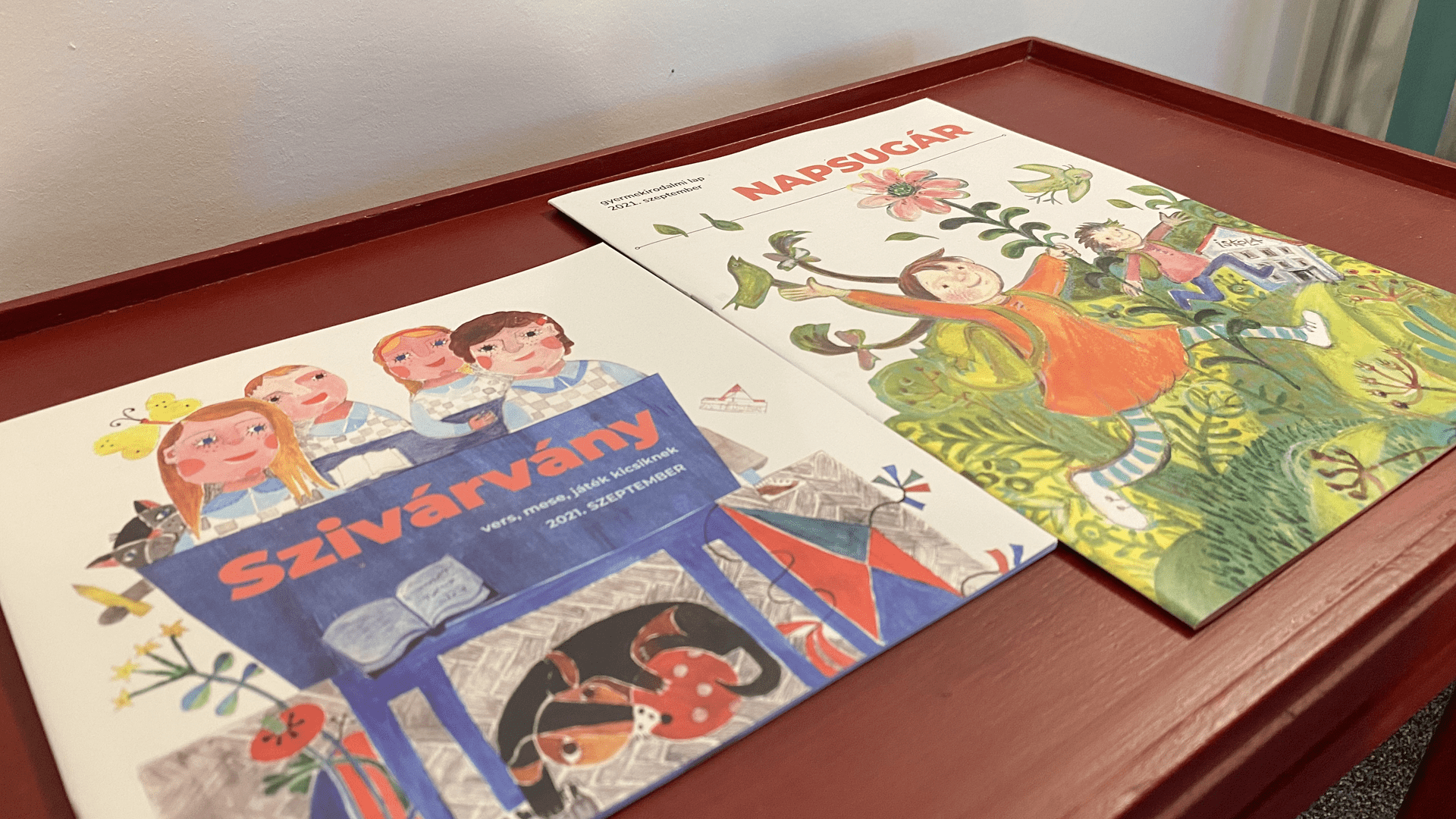
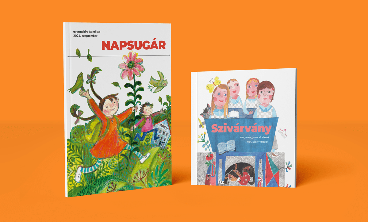
Mission For Napsugár Publishing House, the rebrand was not only about refreshing the visual identity, but also clarifying its market position, operations, verbal communication and appearance by going back to the roots of the magazine.
Outcome Considering that Transylvanian contemporary artists have always published in these newspapers – who have deeply defined the literacy of the Hungarians in Transylvania – we could not lose sight of the rich written and visual language that has always defined these magazines. We believe that we can only talk about the quality of the creative work if we understand the artistic decisions that have shaped the image of the Napsugár magazine. It would be a huge mistake to deviate from this image, but it needs some nurturing and refinement.
Results The need for these children’s literature dates back to 1956. It took shape in 1957 and moved into the apartments, bags and children classrooms. While market changes have constantly shaped the image of these papers, the creators have never lost sight of the legacy. It’s a real challenge to work on a paper-based medium nowadays, when visual noise rumbling in digital spaces. In this case you need to pull back the “volume” a bit, and try to stand out with clear shapes, color palette and layout.
THE PROJECT When the management of Napsugár publishing contacted us in 2020, their primary goal was the refreshing of the layout of the Napsugár and Szivárvány magazines. They wanted a look that snatches the pages out of today’s huge visual noise and puts them back on the children’s bookshelves.
Thanks to the ongoing relationship with teachers, the publishers are notified first-hand of any changes that take place in these magazines. As a result of this, the market is filled with colorful, vibrant publications which are hard to distinguish. In contrast, the goal of Napsugár Publishing House was to ensure that their publications represent true value, and to feature contemporary artists in their columns, and last but not least to enrich the children’s imagination.
BRAND STRATEGY It is necessary to understand the market changes for these magazines. Why do more people buy these kinds of magazines? Or why wont they buy it? What type of contents are recommended? What is the content that was published previously, but discontinued now or it only appears occasionally?
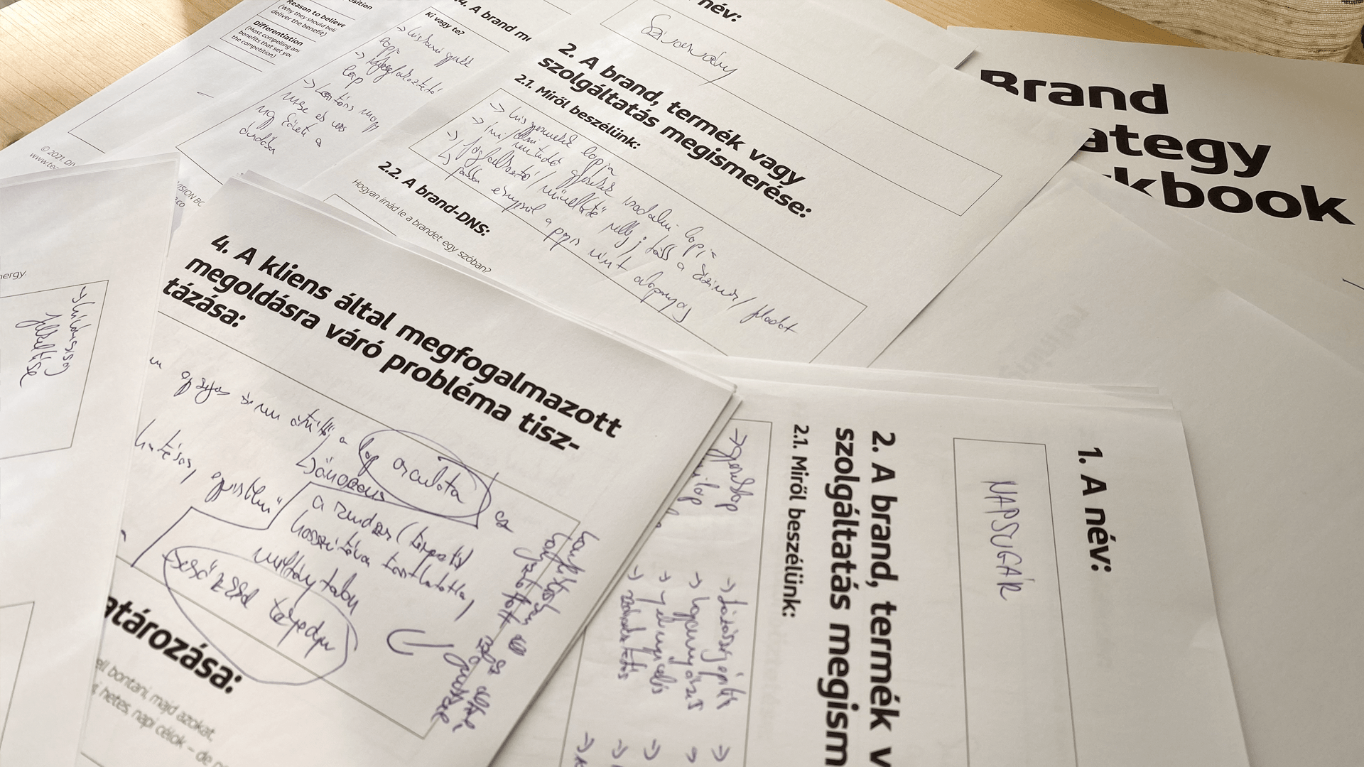
Many factors influence the operation of such magazines, which is why for a brand of this size, the most important thing is the knowledge and understanding of the operation mechanism. The perfect tool for this was an in-depth discovery workshop.
During this workshop, we were not only able to find out the publisher’s core values, but also examined their competitors, target group, consumer behavior, and so on. This made strategic planning much easier, with a clear goal. “We want a magazine that kids enjoy reading. One that arouses their curiosity, develops their taste and imagination, and makes them love literature.”
VISUAL IDENTITY The goal mentioned above defined everything: these magazines should be returned to the artists and childrens. All visual frills should be removed. There must be space in these magazines for illustrations and texts that reinforce the goal.
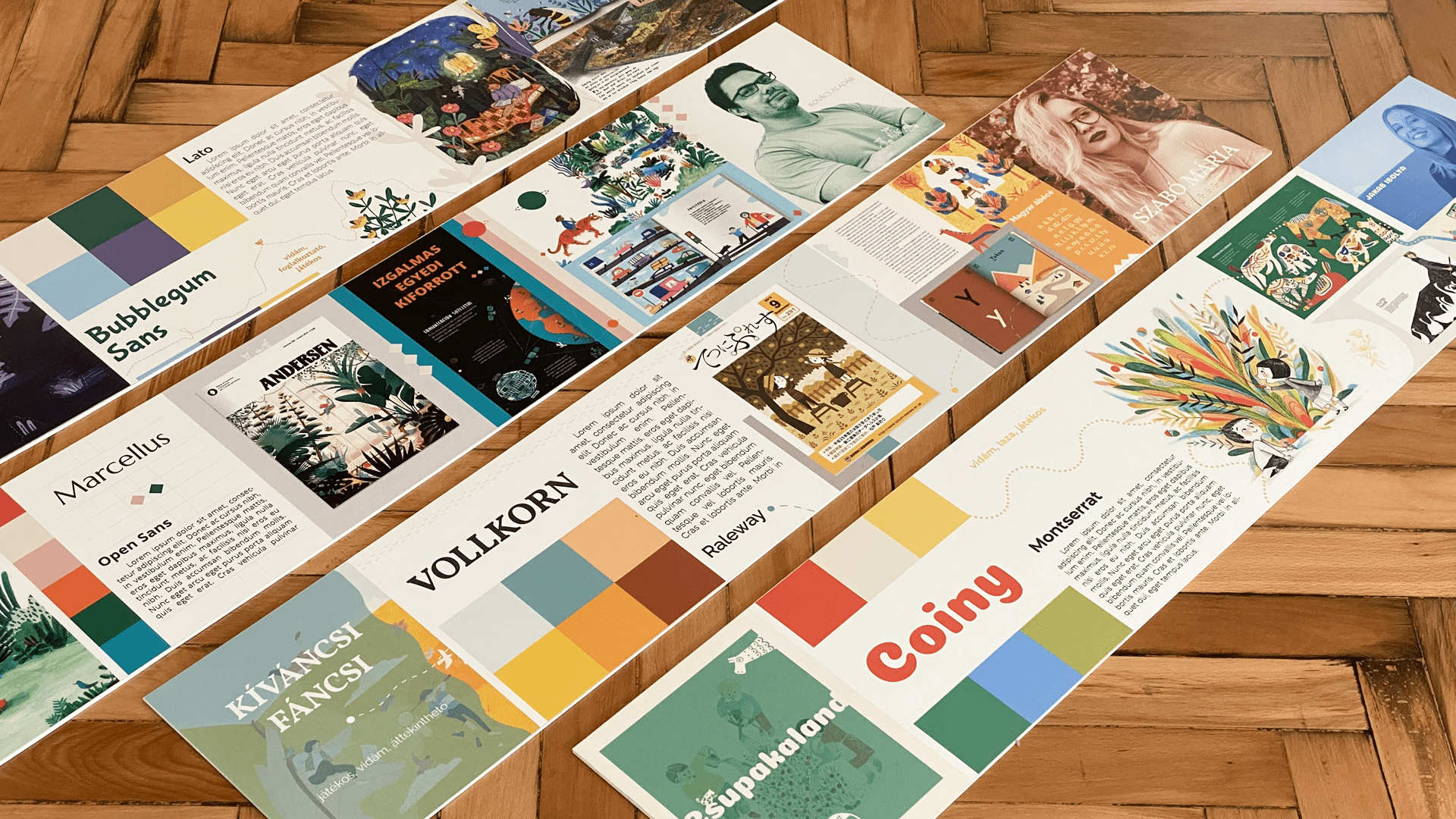
Learning about the visual linguistic features of the category, we decided to move towards minimalism. Instead of the patterns and fill effects, the white base papers need to do the talking. Anything can be built on this foundation, and it gives back the elegance that comes with the type of content these magazines published on their pages. Clear shapes, transparent structure, striking visual codes, lots and lots of illustrations, playful texts, and poems for children.
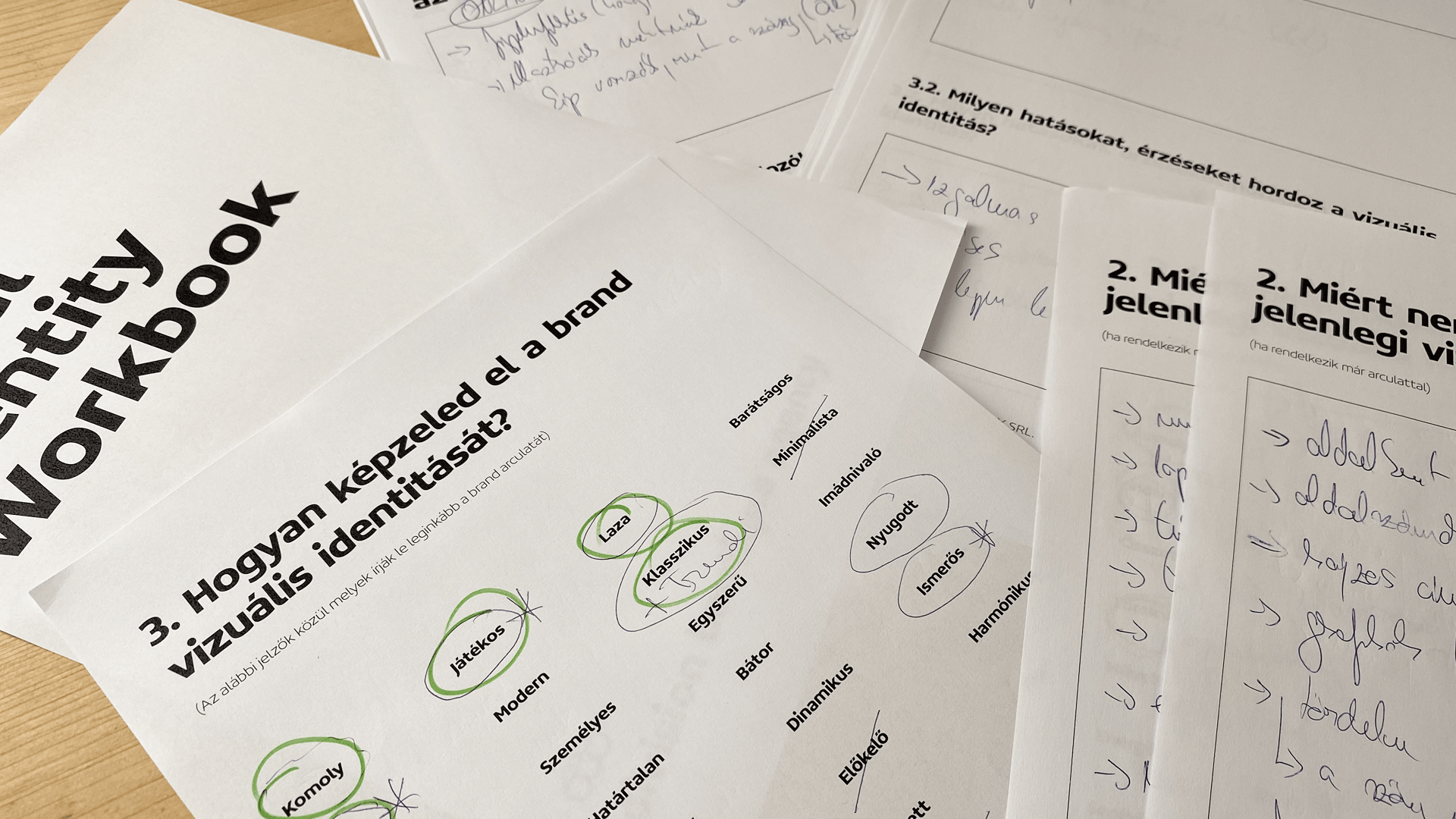
LAYOUT DESIGN The well defined visual language predicted the layout design and the webdesign as well. In the case of the issues the transparent structure helped a lot, and made the placement of the text and illustrations easier. Unnecessary visual noises were eliminated. During the workshop we defined the visual codes like colors, shapes, moods and fonts that we wanted to use.
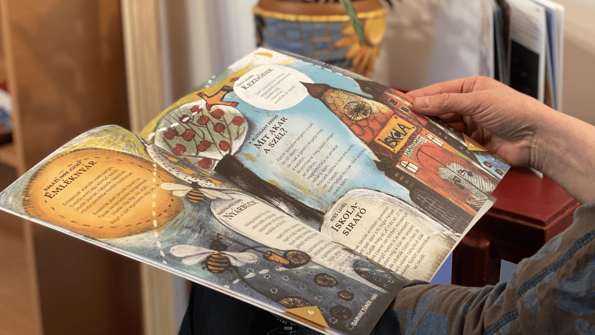
The main emphasis was placed on open spaces. That formed the base. We wanted to keep the sheets open instead of closing them with borders, patterns or other filters. In order to make the readers know what they are reading, we made the content structure color coded.
Throughout the whole process, we did not lose sight of the 1960s, when the pages had less text but a lot more illustrations. We drew a lot of ideas from the time that these pages were created.
WEBSITE In addition to the magazine layout, the website has also been renewed. The visuals of the website follows the same core values that we highlighted in the sections above: transparency, a lot of white spaces, consumer oriented. The aim was not to recreate the magazines in digital spaces, but rather supplement it, so that in the future they can go hand in hand with the magazine.
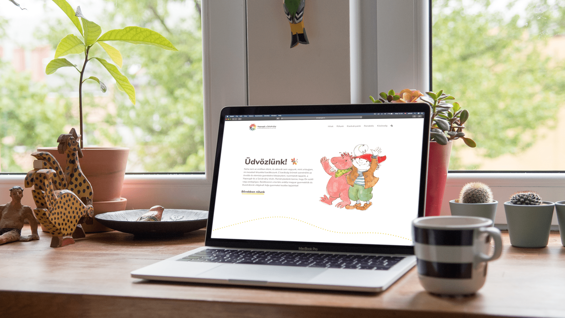
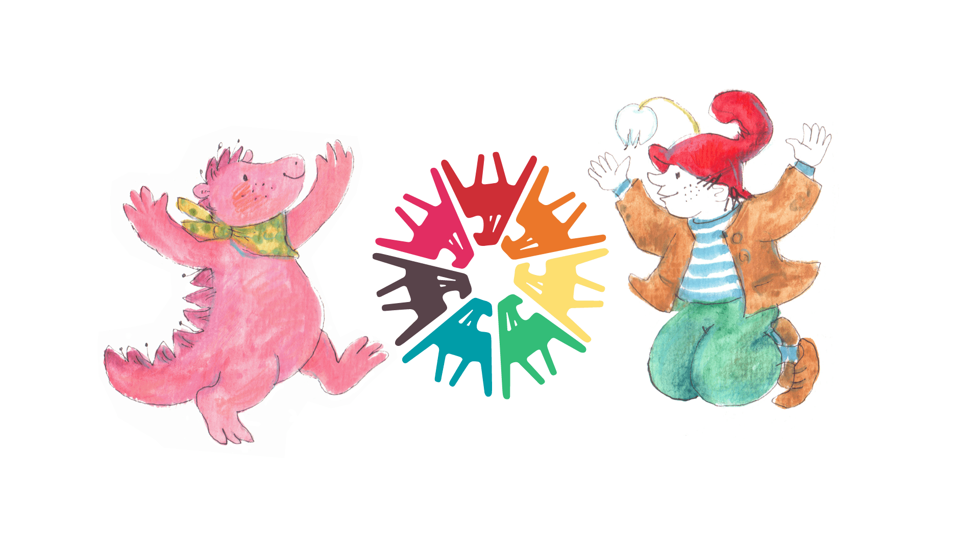
Csipike and Kószabósza, the two characters have a key role in the website, they guide us through the various menus, and help the viewer to find their way around. The website is a classic web interface in a sense, but it’s also a meeting place for the community, as the most important information will be displayed here.