It’s been an uplifting feeling to work on a project that has also helped us understand why our backs hurt while working and what we can do about it.
Mission Building a human-centred brand that reflects all the expertise, care, and kindness that clients experience.
Outcome The forms and shapes of the visual identity are built on the three main types of services, making sure that the color scheme of the brand also reflects the field in which Aprophysio operates.
Result As a result of the visual identity and the communication strategy, people appeal to Aprophysio’s services with confidence.
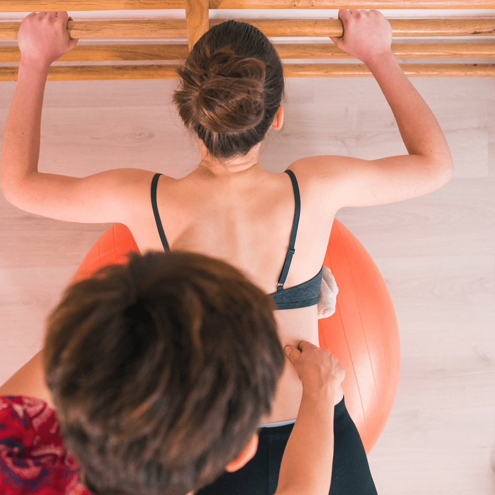
THE PROJECT Working on the Aprophyiso project was a great challenge. Not only because it was the first major project we undertook, but also because of the service provided by the customer. We like to work on projects that we believe in. Aprophysio is human-centred, it focuses on helping people, their main activities being early motion diagnosis and development, and the treatment of child and adolescent spinal deformities.
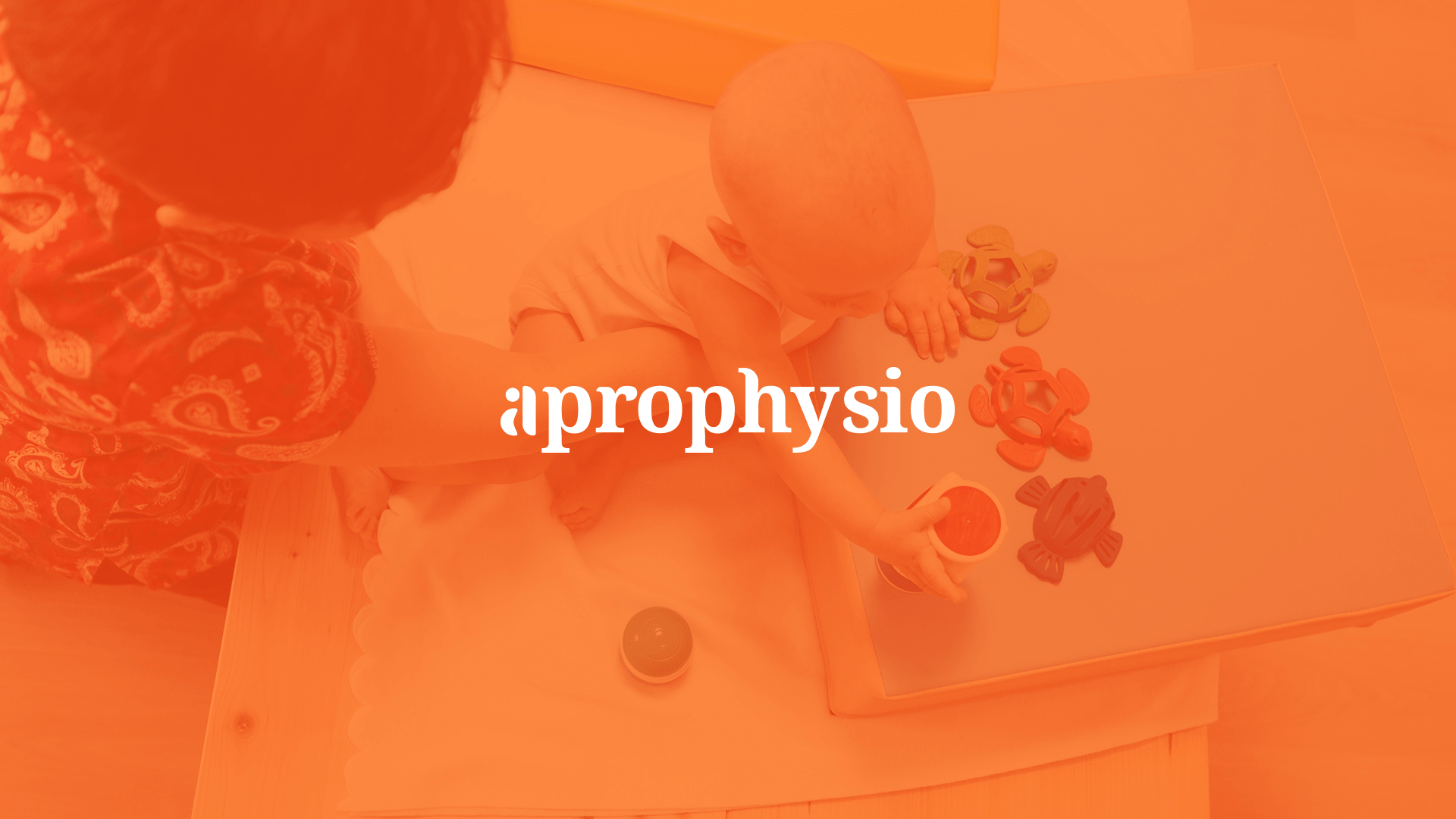
VISUAL IDENTITY Since the service focuses on people, we wanted to create a visual identity whose form and colours would earn the confidence of consumers. The logo was created based on the brand name. The name is simple and personal. It consists of the name of the founder and the name of the specialty.
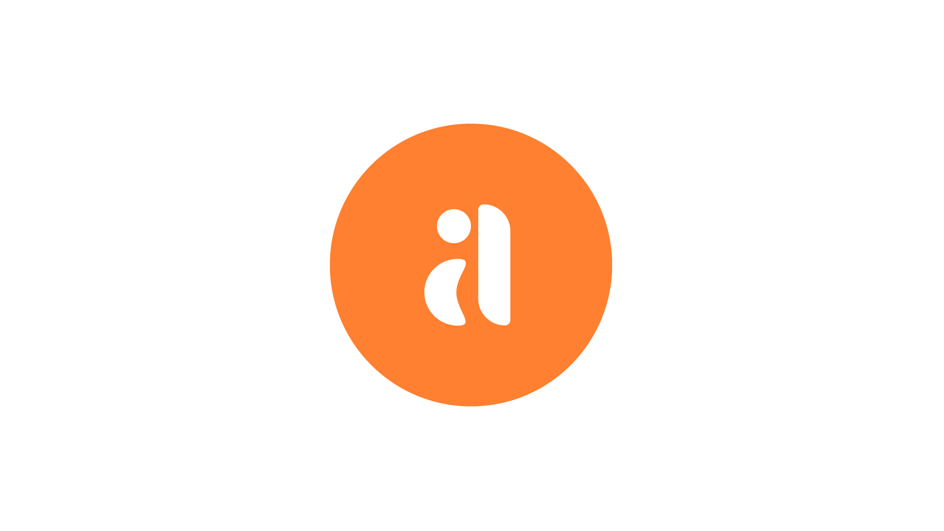
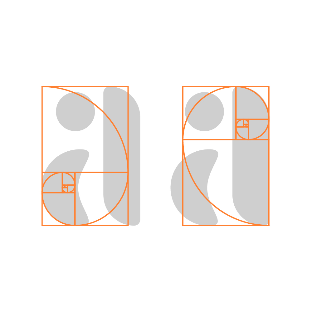
We liked this name and decided to create a typographic logo that offers the brand the attention and gravity it deserves. The unique initial letter, whose graphic components draw attention to the three main therapeutic methods, gives the brand a proper playfulness, while the other serif font type enhances the above-mentioned seriousness, attention, and reliability.
The colour universe is based on skin tones. Of the soft peachery, brownish, pinkish shades, which are present on the various surfaces of the skin, we eventually decided on an orange colour. Its use on a white or dark gray surface provides appropriate visibility.

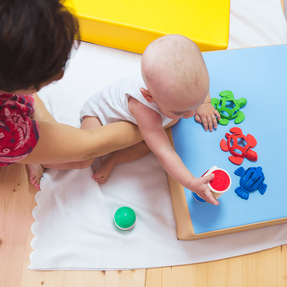
Photography The primary consideration when taking photos was the presentation of the various therapies. We pursued taking pictures of actual development practices to provide a realistic picture of the service itself.
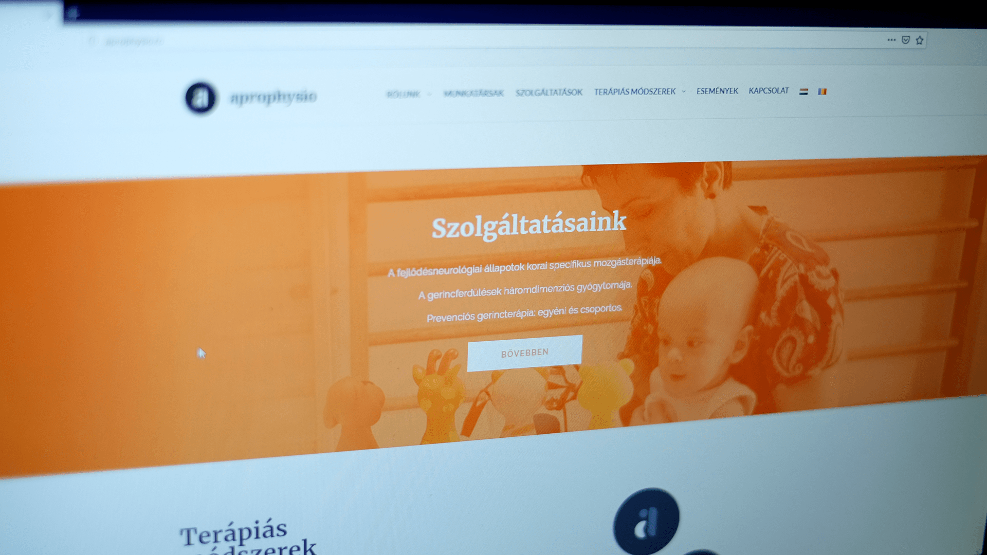
Website We also provided web design and web development for Aprophysio. In addition to learning about the therapies and services provided by Aprophysio, the website also introduces the therapists themselves, which is essential for building trust. During the development of the site, we found it essential to create a content management system (CMS), since this way, the specialists can also easily upload new content and current events.
Communication Aprophysio uses two main devices to communicate with clients. With traditional print-based media, like flyers, users can learn more about important information. And the online communication channel is the official Facebook page, which shares content that brings the services closer, helps build trust, and communicates the high quality of the services.