When making home design decisions, a professional partner is almost always needed, whom you can confidently entrust with the construction. For a few months we were able to get a glimpse of this world too, thank you!
Mission For Ildisign, the goal was to build a brand that, through its characteristics, highlights and reinforces its presence in the local interior design market.
Outcome In creating the visual identity, we placed great emphasis on the symbols considered important by the client, keeping in mind the service segment in which the brand operates. The color palette and gradients are meant to express the uniqueness of the brand and the quality of the work it represents.
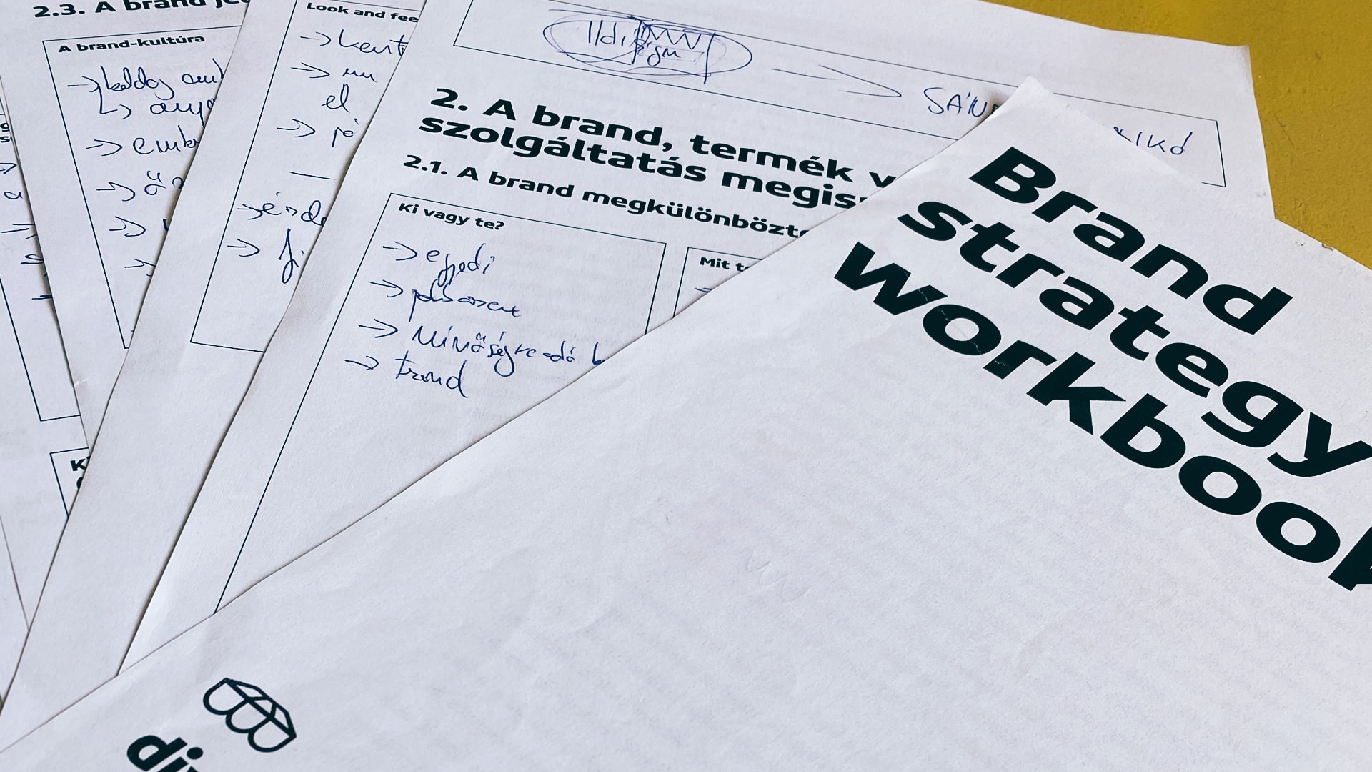
STRATEGY WORKSHOP After the first meeting, we held a brand strategy workshop during which we clarified all the questions and decisions with which the client came to us. During the four-hour workshop, together with the client we examined whether the chosen name was able to cover all the wide range of services that the client would like, and we also got a clear picture of the strengths and weaknesses of the brand. We have outlined the target group categories and defined the guidelines along which the brand can be built.
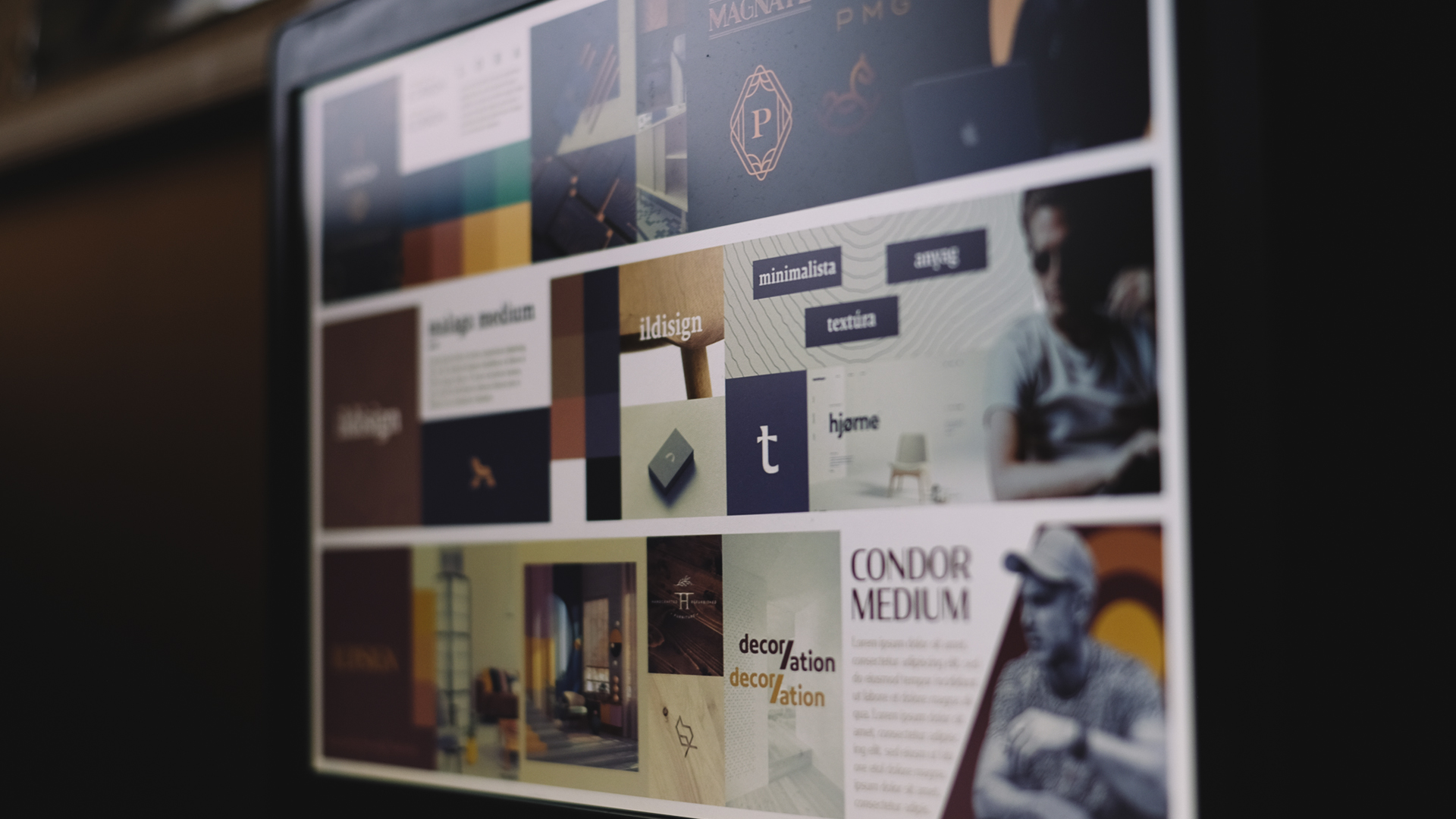
Based on our brand strategy workbook, we created four stylescapes. Stylescapes are similar to moodboards, except that they are based on a well-defined structure, and contain more than just visual elements. Stylescapes provide the basis for a brand’s visual identity.
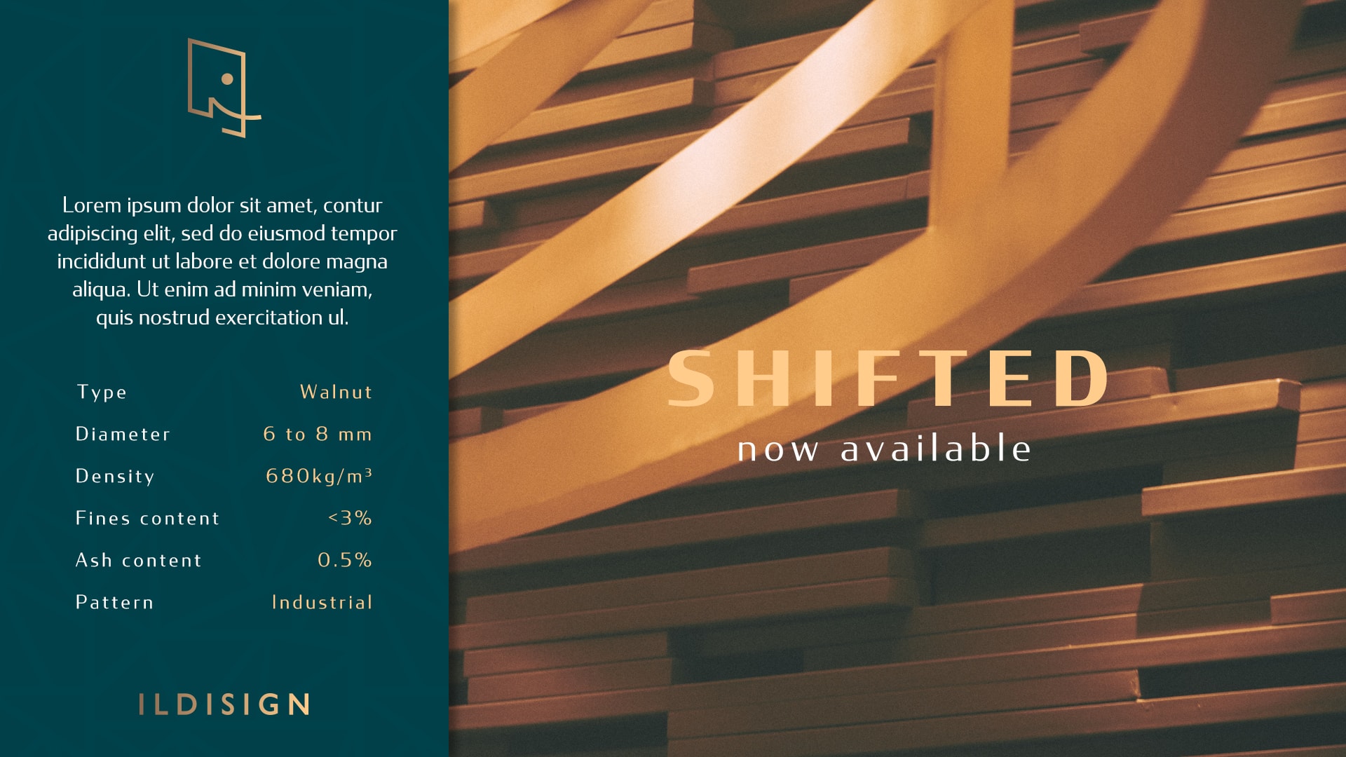
VISUAL IDENTITY We began to build the visual identity based on the fusion of two stylescapes. The core part of the concept is the elephant, an important symbol for the client which symbolizes strength. In the end the whole visual identity shifted in this direction.
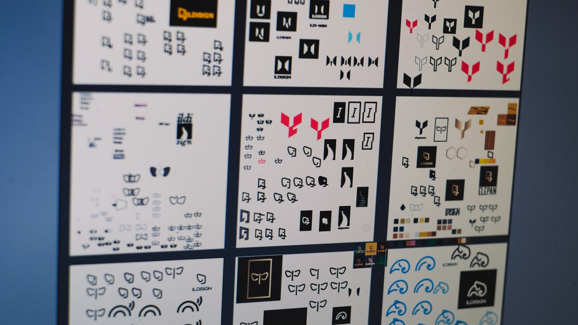
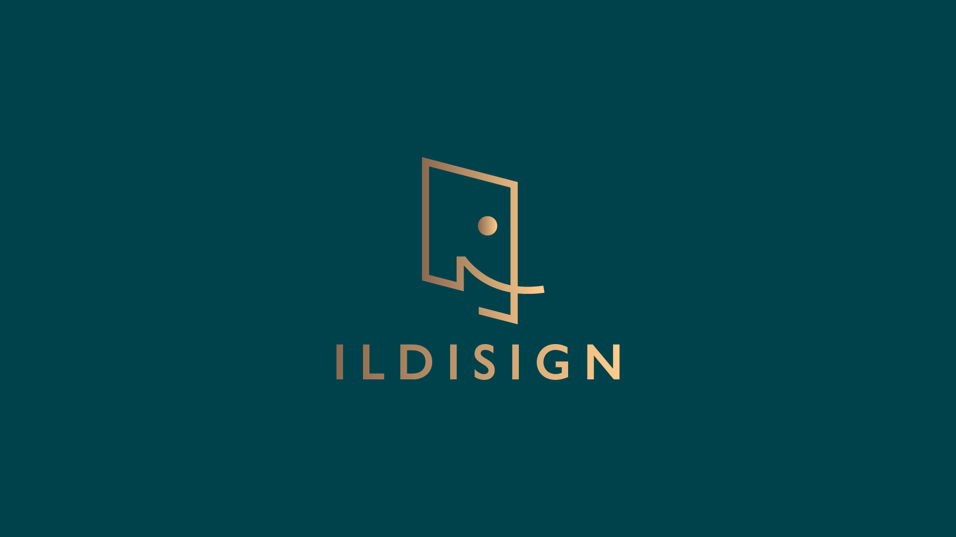
In addition to the production of individual partitions, Ildisign’s services also include interior design and planning. With this in mind, the final logo bears the marks of the technical drawing, keeping in mind the elephant motif as well.
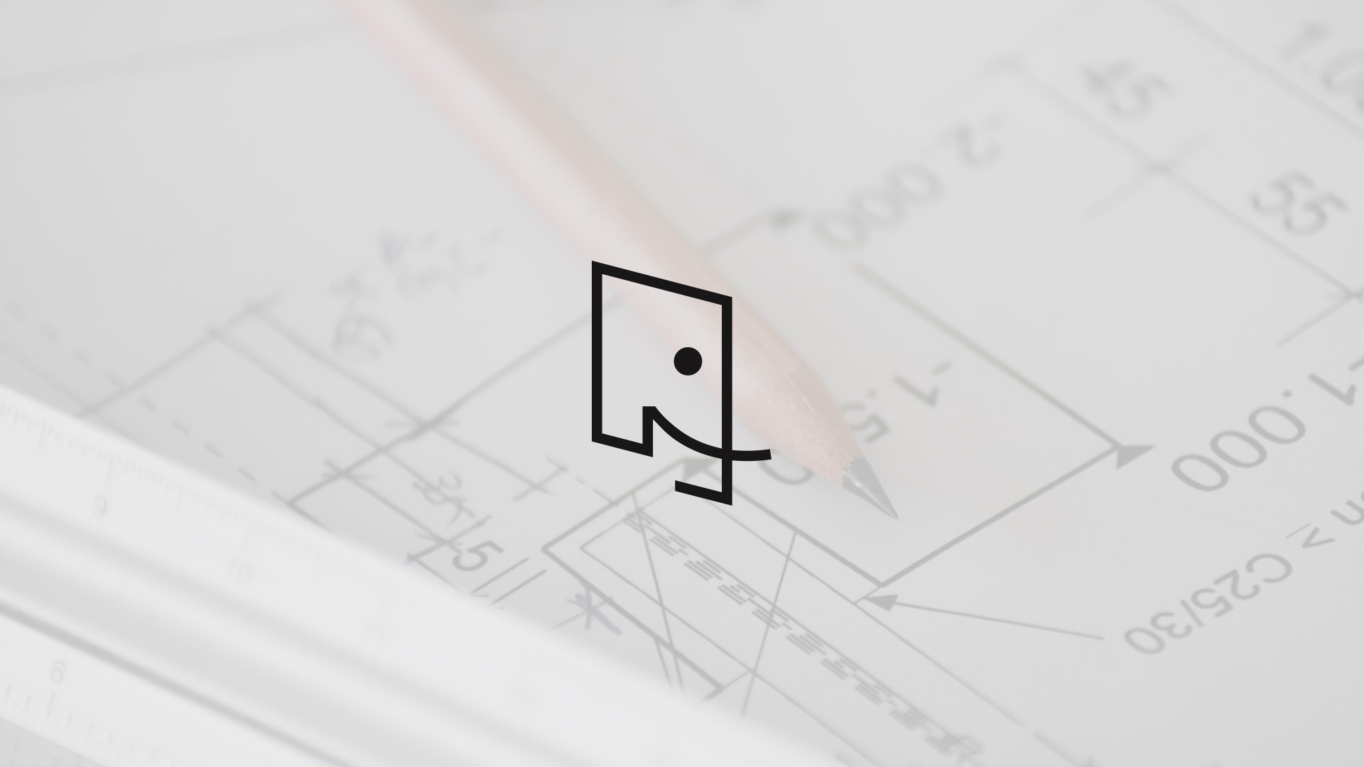
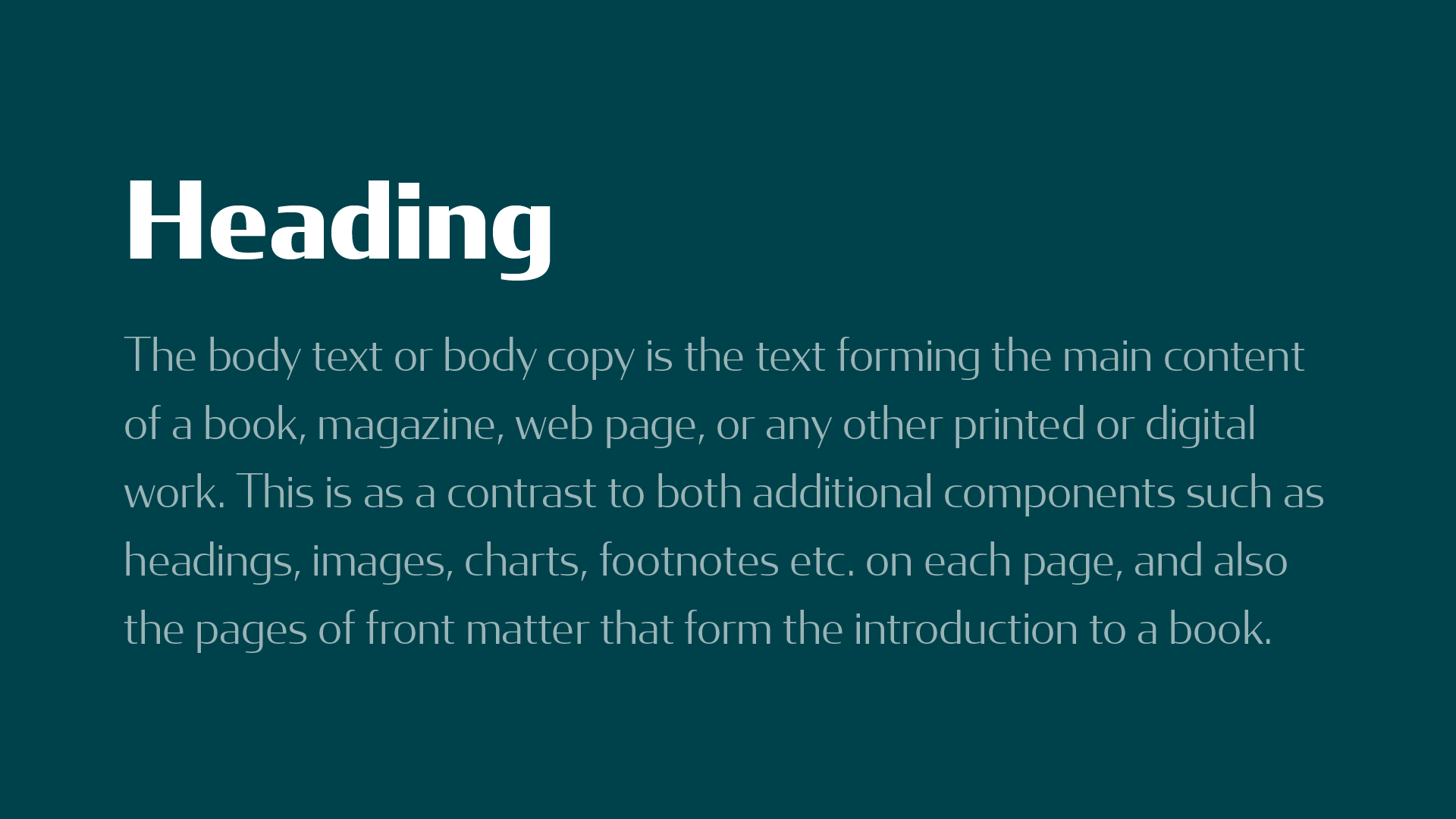
The dark-based color palette of the visual identity, as well as the gradient used for the logo and additional elements, are meant to express the uniqueness of the brand and the quality of the work it represents.
The Concord font family used in typography evokes the Art Déco trend. The strength of the font lies in its line drawing, the alternation of thick and thin lines. The bold font used in the title and the thin font used in the text also build on this strength.