For a few months, we had the chance to be foresters, although in a different kind of forest.
The Project Pine Lines are the foresters of social media. Their aim is to provide better reach through more effective communication and advertising on online channels used by the target groups of the customer.
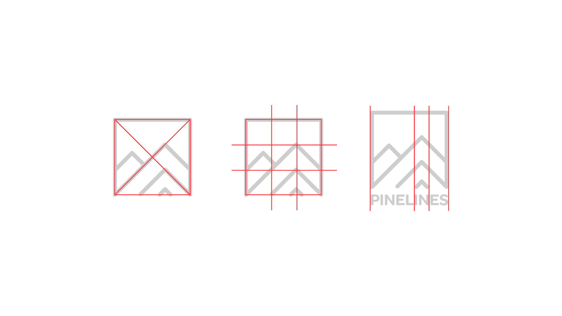
Visual Identity The visual identity of Pine Lines is minimalist and unpretentious. In designing the image, it was a great help knowing the main guidelines with which the client can identify. Simplicity, clarity, closeness to nature. During the meetings, we quickly realized that the customer’s ideas were centred around the pine/pine forest, as the pine branches symbolize a constant increase/decrease, similar to the market graph.
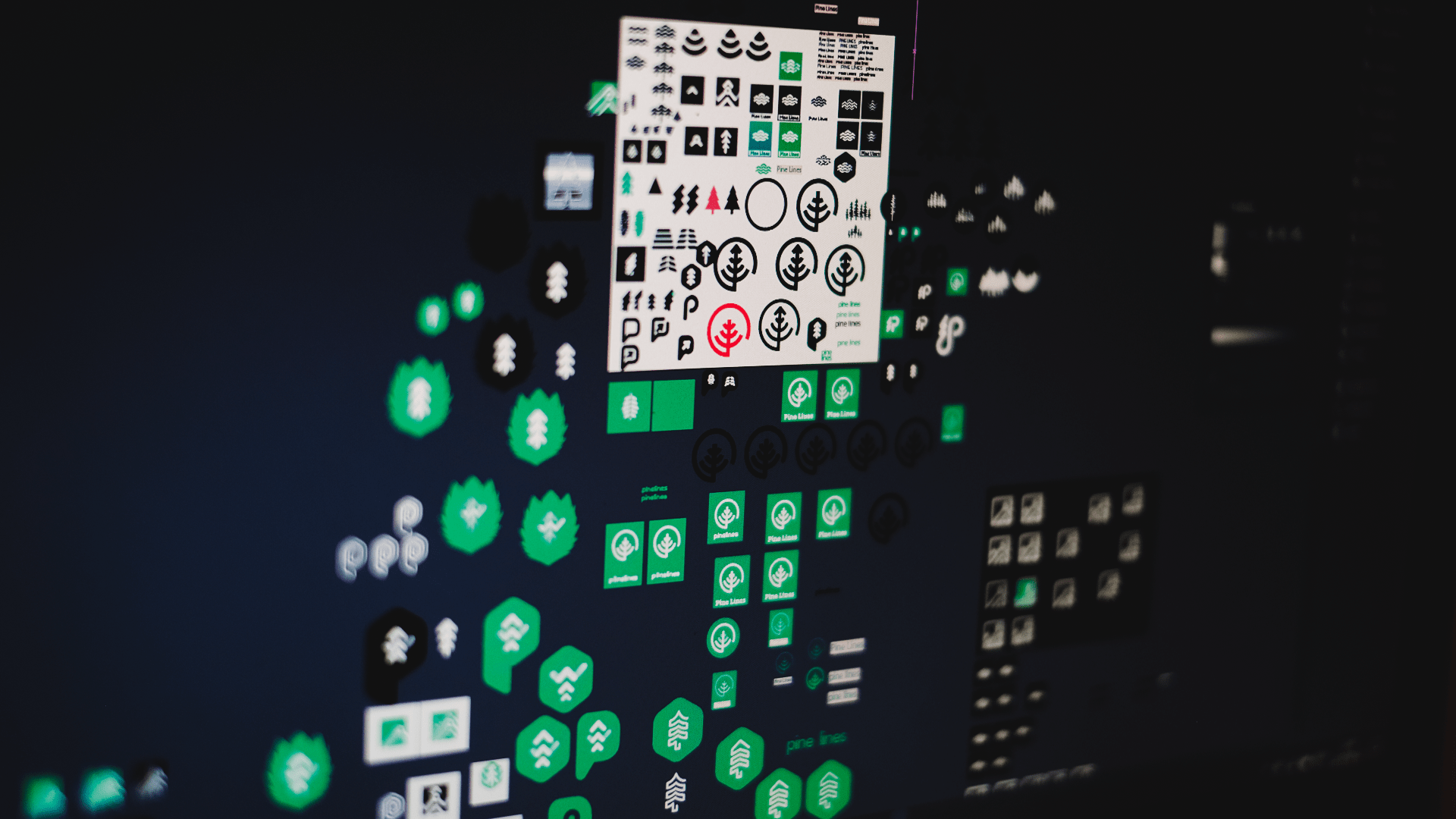
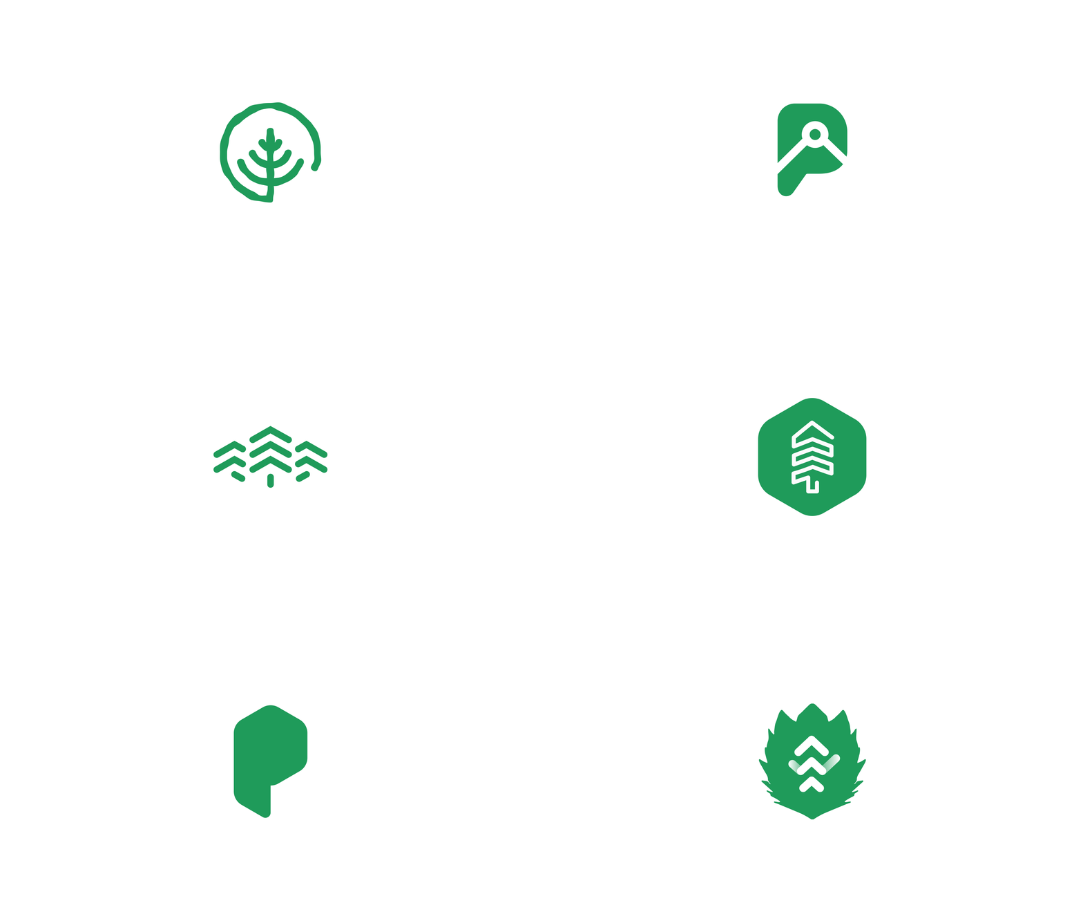
The shapes and colours used in the logo are meant to show this motion, while the silhouettes of pines and pine forests are also visible. With these in mind, we decided on a minimalist Line Art logo.
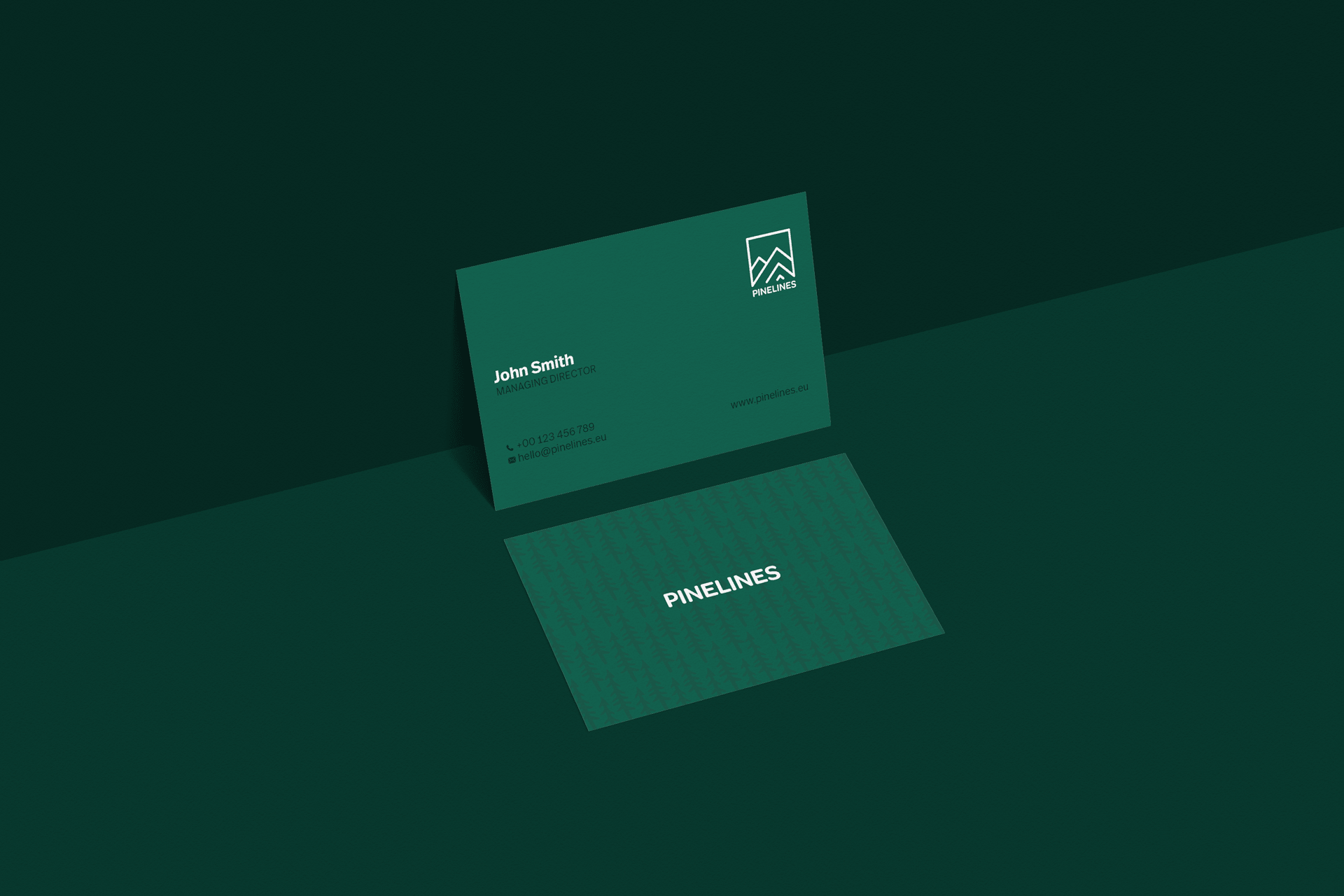
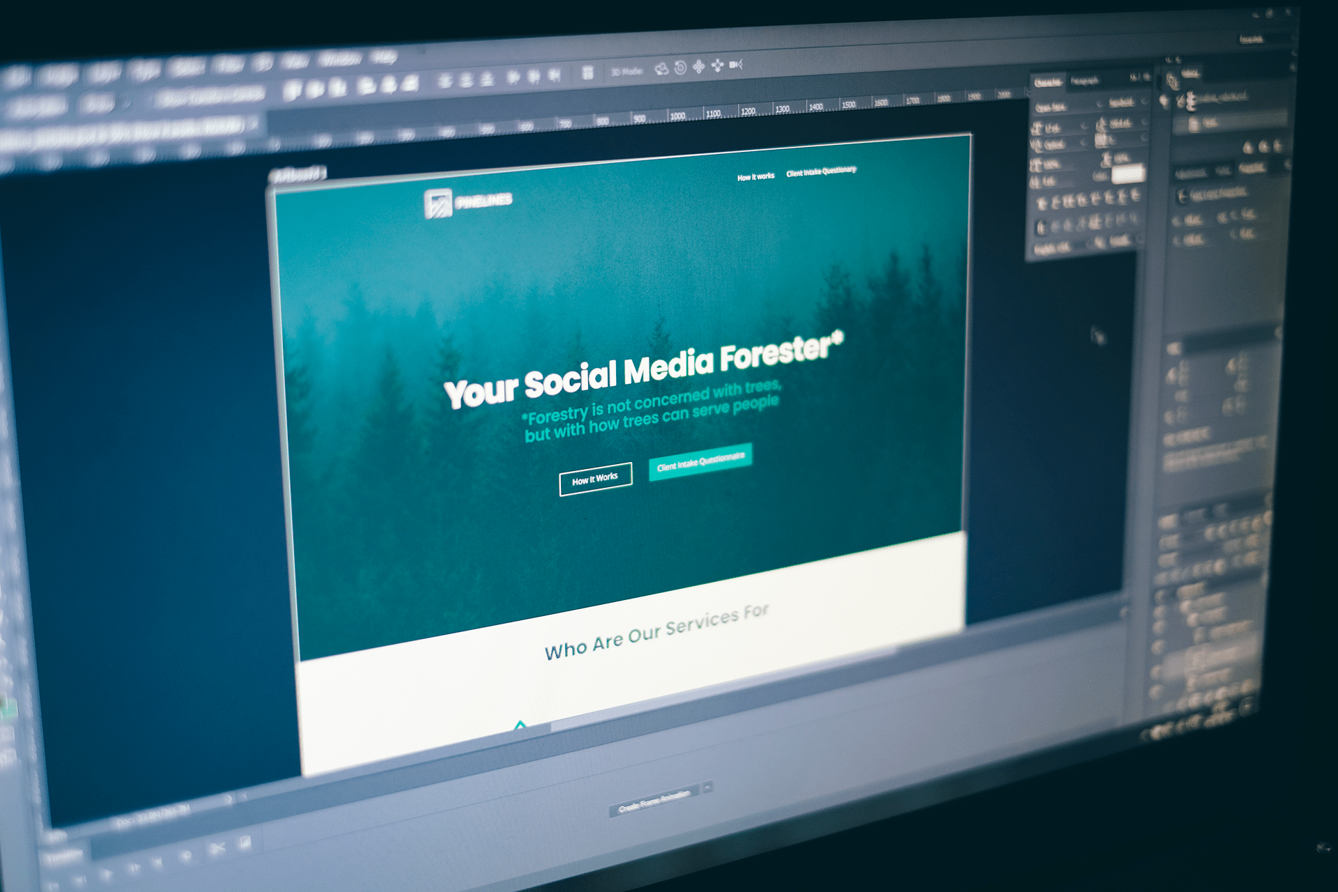
We have also created a website design for the corporate identity, the function of which is to present the operation of the service in the simplest way possible, and to provide potential customers with a contact possibility.
