There are many ways to build many kinds of bridges, but it only makes sense if we also travel on them. - Zsófia Kálmán
Mission A visual identity facelift that retains the core values of the previous visual identity, but takes into account current design solutions.
Outcome Building a visual identity that reflects RMGYE’s philosophy, mission, and atmosphere of the events they organize in its form and color scheme.
Result A distinctive visual system that enhances the recognizability of RMGYE.
THE PROJECT The Association of Hungarian Special Educators in Romania (RMGYE) was established in 2004 in Cluj-Napoca. Its purpose is to promote the profession and to improve the quality of special education by organizing professional trainings and conferences.
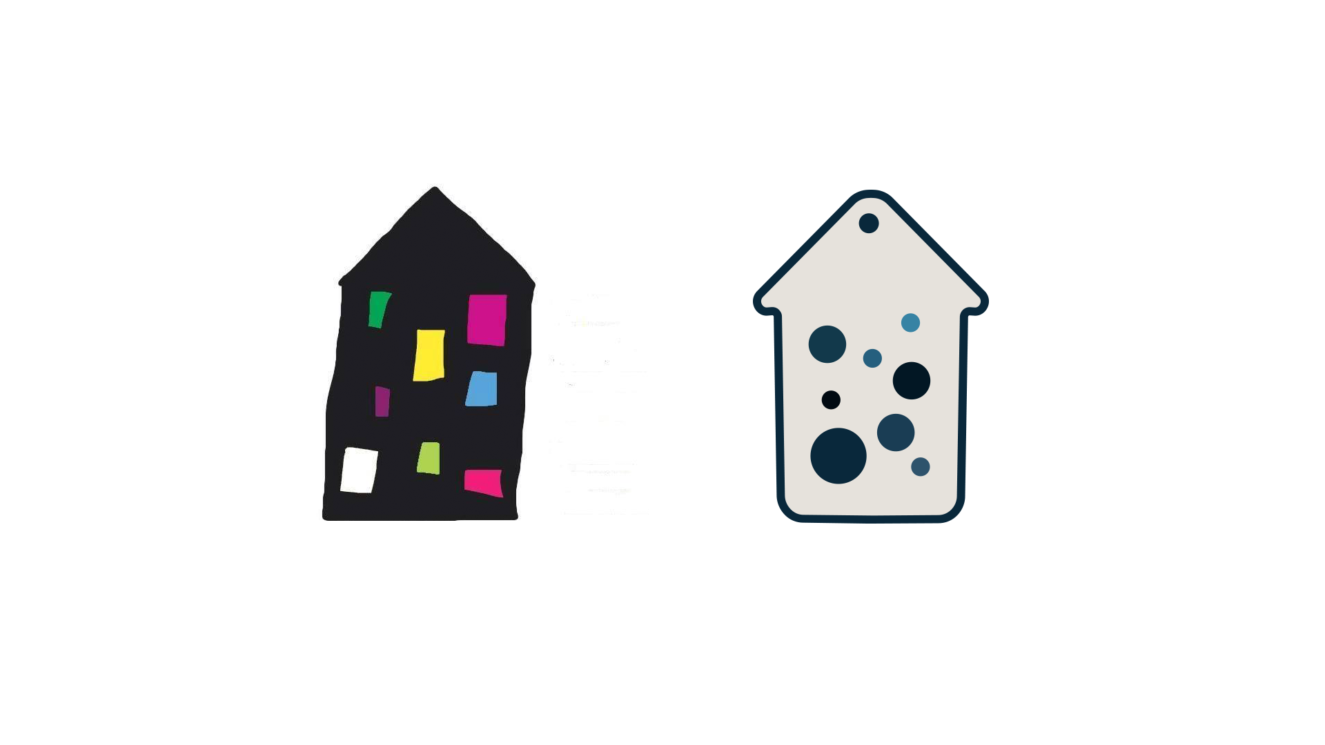
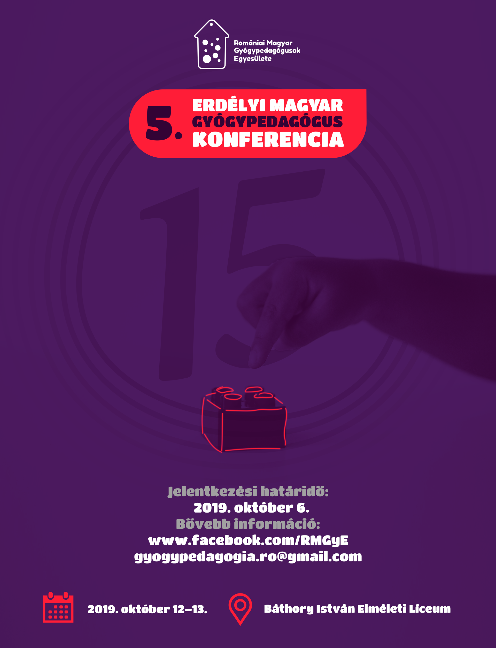
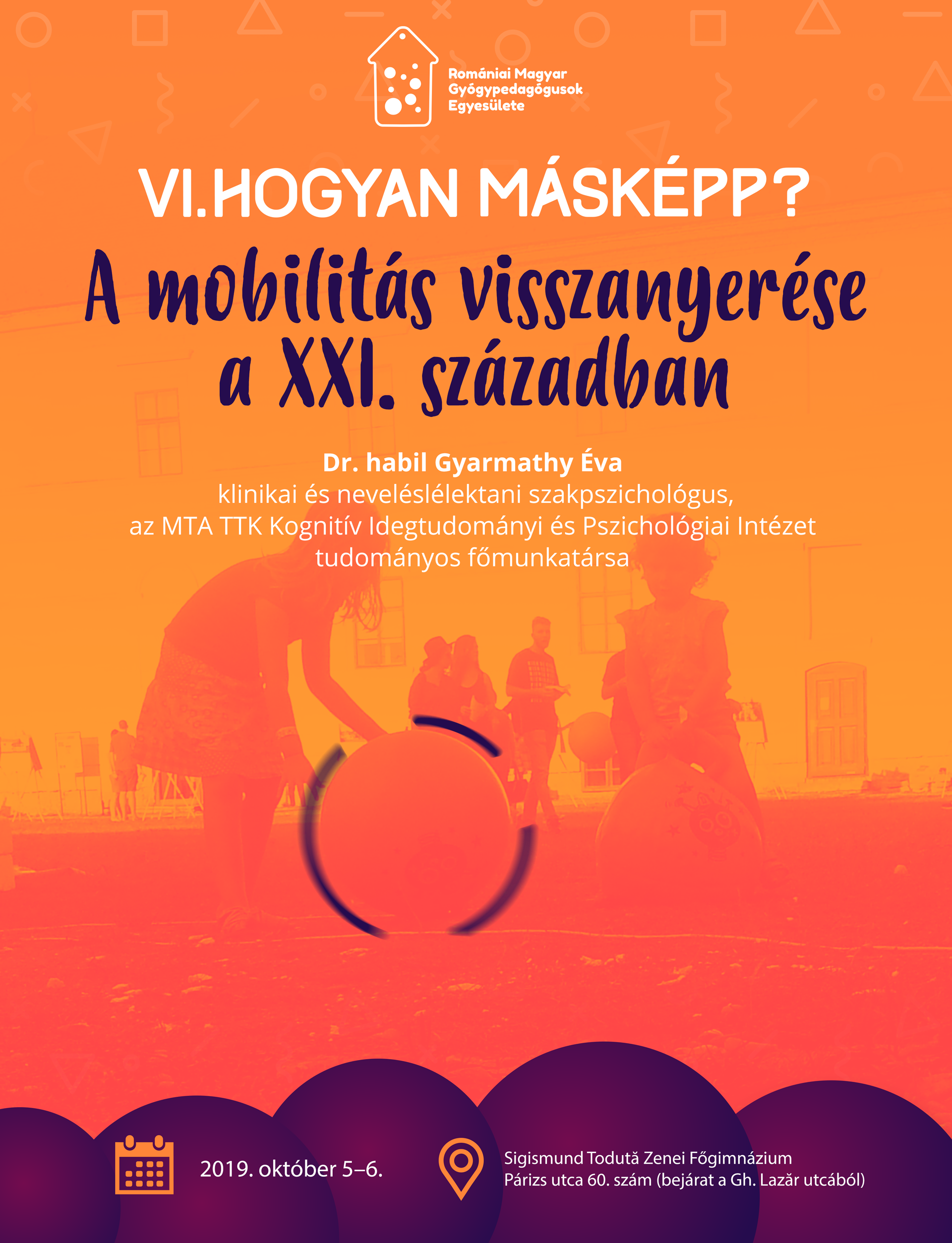
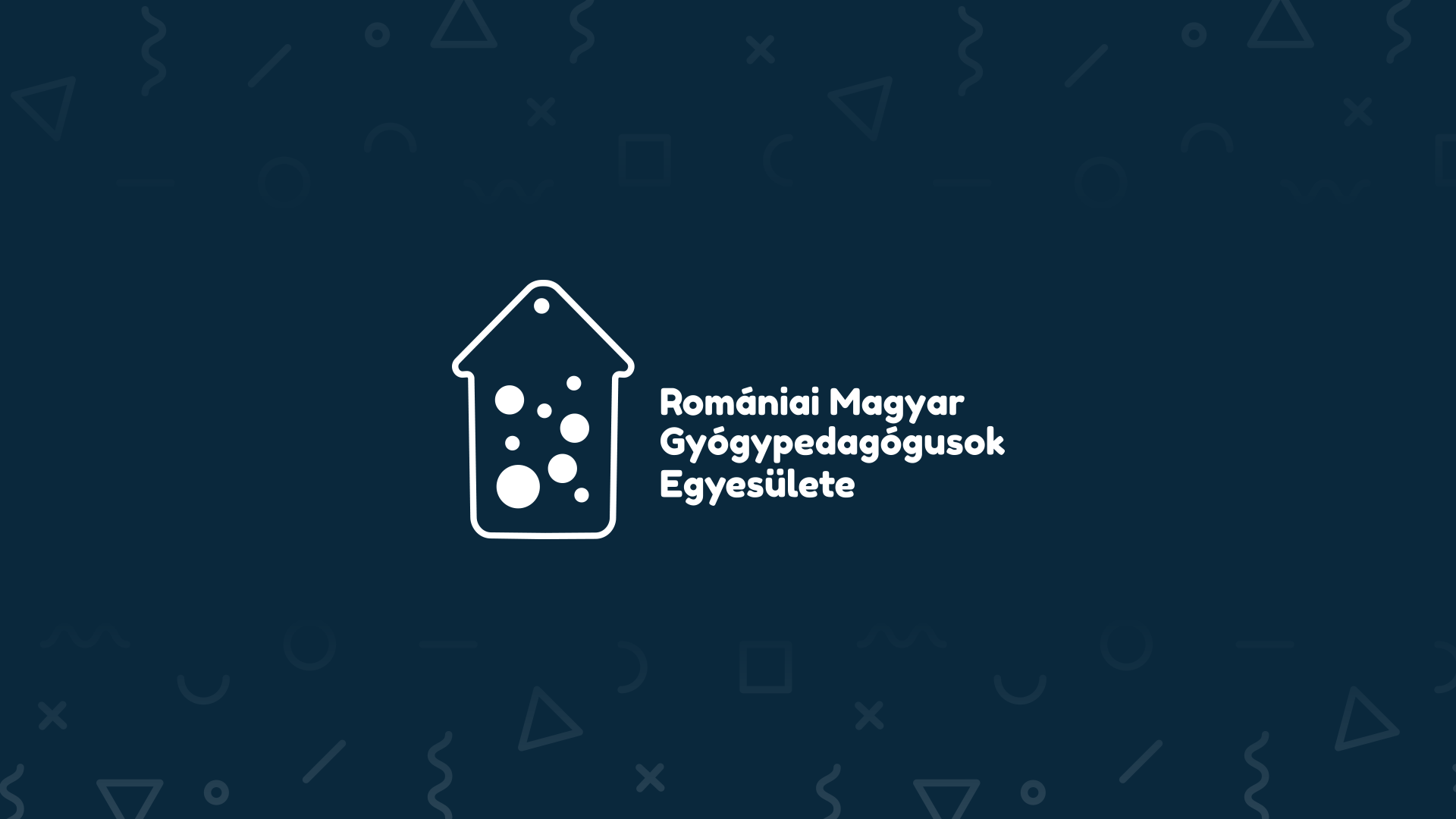
VISUAL IDENTITY The association had previously had a known visual identity, but management felt that it did not match the current visual trends. They wanted the new identity to be clear, minimalist, easy to decode, and recognizable. The house with coloured windows and the text type logo beside it has been formerly used in so many places that we thought it would be better not to replace it completely, but to do a light facelift on it. In addition to replacing the previously used black color and the playful, colourful font, we paid attention to using soft-shapes in the new-looking logo, as this is more in line with the principles of the association. Changing the color cavalcade also helps the receiver to easily decode.
The shape of the logo and the font also determined the use of textures. In addition to the pictures, we used gradients on the various event posters, all of which helped create a sense of playful intimacy.