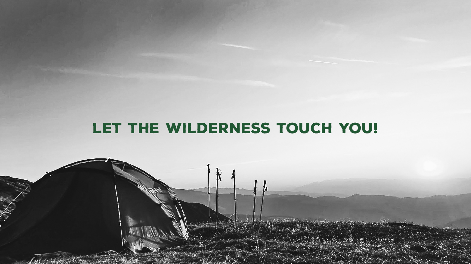
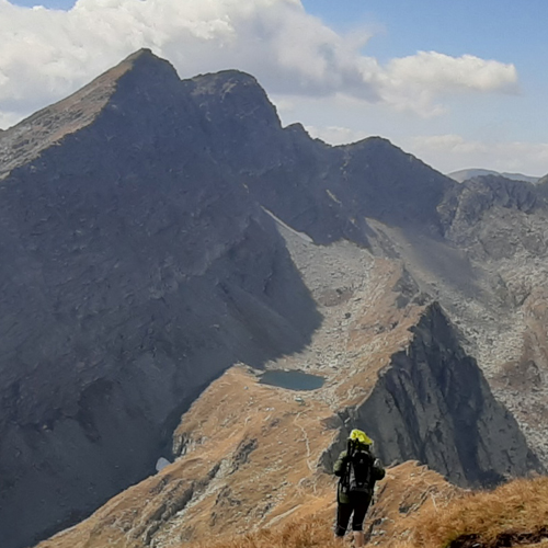
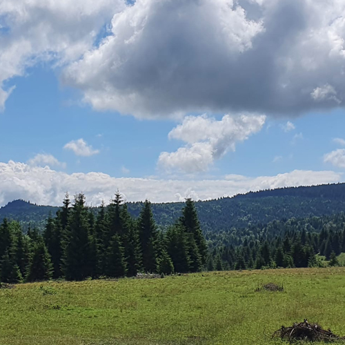
It’s time to put down the phones, and break out from the concrete jungle. Breathe together with nature, wonder at the mountains, valleys, rivers, and experience that the vacation is not only about other countries or the sea. Be present. Let the wilderness touch you!
Mission We’ve been working on a brand that provides not only recreational opportunities within its category, but much more. It provides a person- and family-oriented relaxation in nature with rich experiences without technology.
Outcome Our goal was to find the cornerstones on which the world of the Krosslanders could be built. The ideas of the founders included three main landscapes types: mountains, rivers, and fields. The visual identity and all the brand components were built on their textures and feelings.
Result As a result the visual identity, communication style and from seeks to tear the consumers out from the concrete jungle.
THE PROJECT When we first heard about the plans of the founders, our question right away was: how will this business differentiate from its competitors within the category? Then as we got closer to the project, it became clear to us that we are talking about a very strong family- and consumer-oriented service system driven by the following goals: breaking out from the concrete jungle – without technology. Roam through mountains, valleys, waters, rediscover the feeling that the phone does not ring there are no drilling next door, that we can be ourselves again while breathing together with nature. The idea was perfect, the professional knowledge was given our task was to find the right packaging.
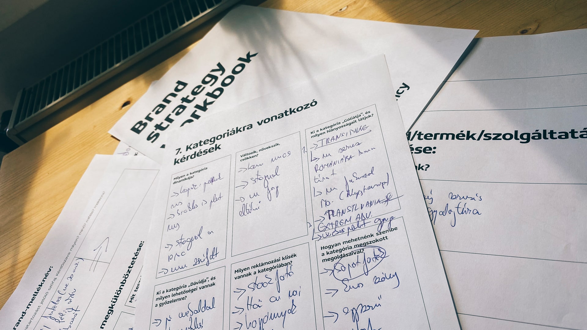
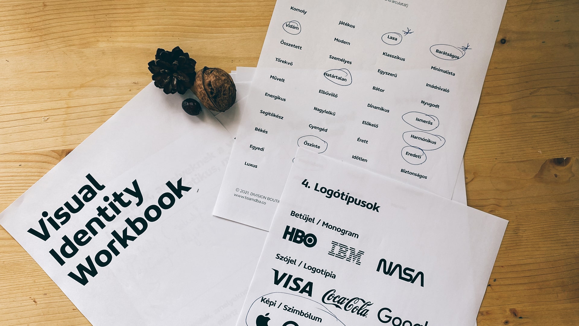
BRAND STRATEGY In the discovery and strategical phase, our main goal was to get to know the project in and out in order to get rid of all the layers that are unnecessary and find the cornerstones we can build on. Both us and the clients need to answer to all the spoken and unspoken questions. We have to have a clear vision about the following components: how are we different from the competitors, is this difference significant, who are we talking to, in what tone we want to talk, what language we want to use? We had to get to know the habits, behaviors and affiliations of the consumers. The ultimate goal was to rebuild these layers along the right strategy.
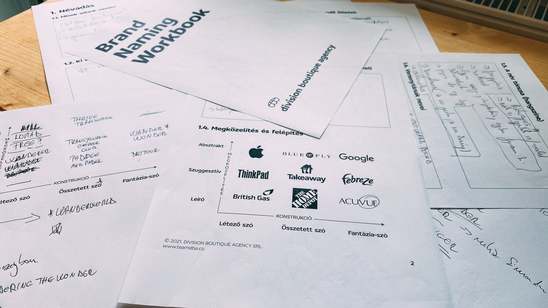
NAMING The brand name is the most important marketing tool. It is more important than any subsequent communication act. All the work has no point at all if the name isn’t good. In the case of Krosslanders, the naming process took over a month with several rounds. We have chosen the name from over a hundred names. We took into account all the features we discovered during the strategic phase. The name had to be compact, easy to pronounce and expressive, friendly to the ear. It also has to sound familiar but not worn out. The syllable number also counted. Here our goal was to include the three pillars that also appear in the visual identity.
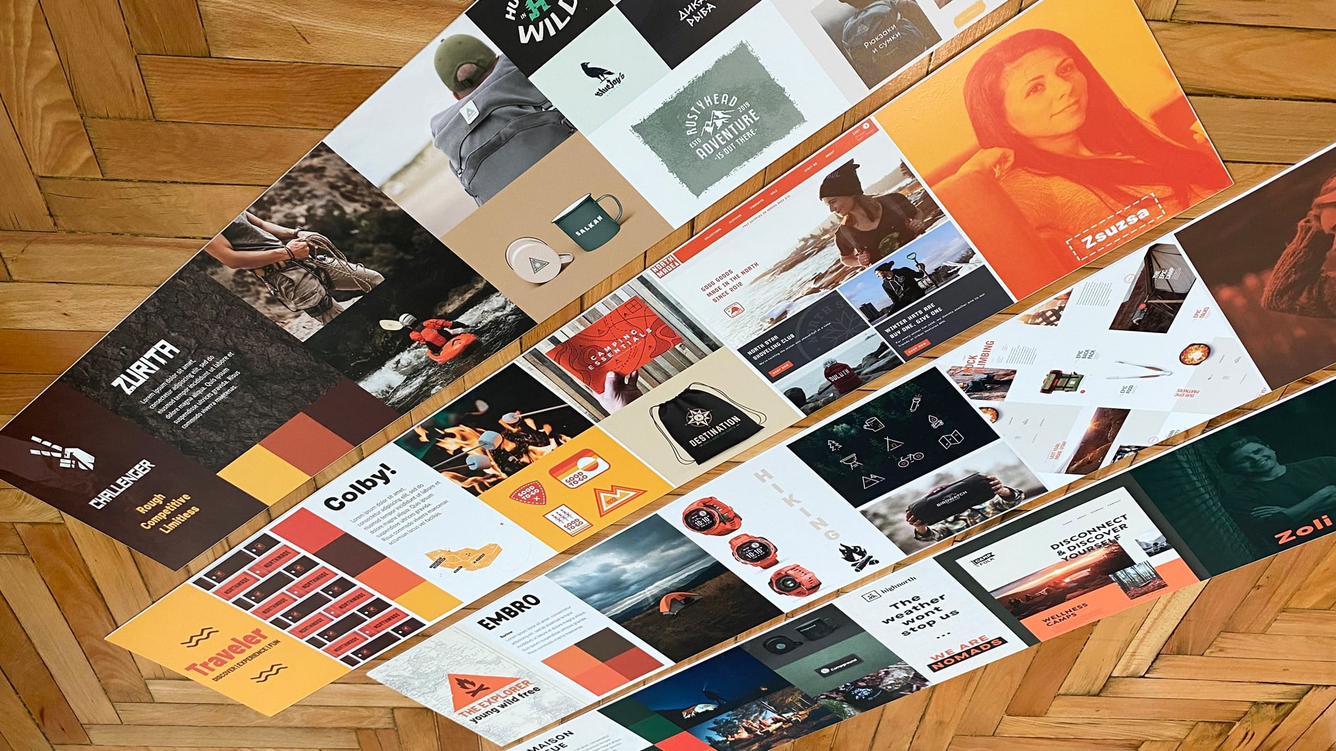
VISUAL IDENTITY
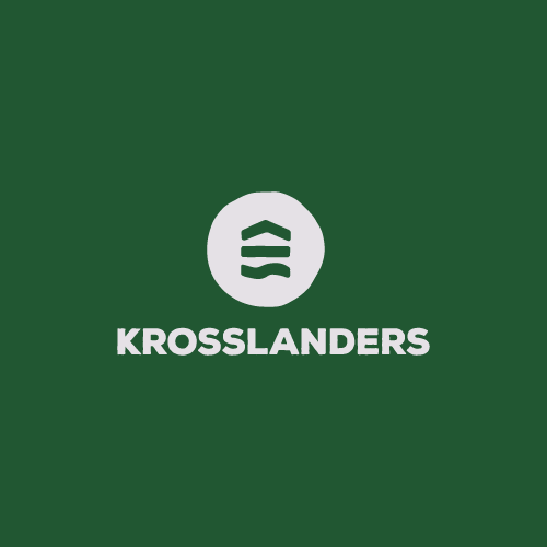
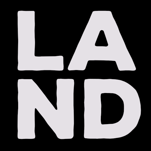
LOGOMARK The main consideration in designing the logo was to present the service itself but not in a very specific representation. In order to do that we thought of a symbol that, like tour signs, is simple yet represents the values of the brand. The Krosslanders logo is inspired by the distinctive topographical elements in the Transylvanian area.

The mountains, the fields and the waters represent the brand, while forming a unity.
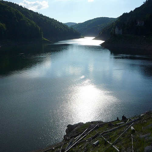
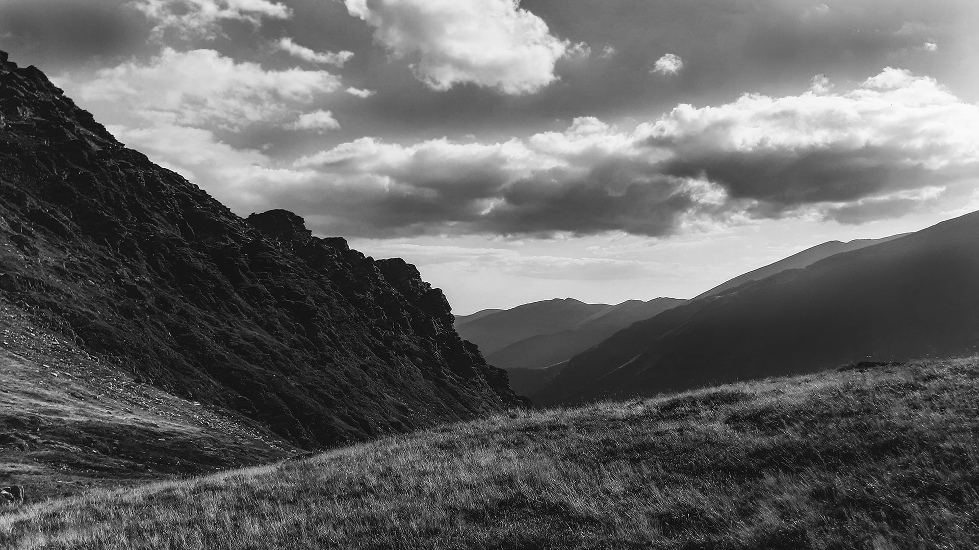
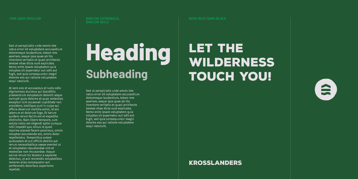
The visual language is based on black and white contrasting photos known as the trademark of Ansel Adams. This visual language presents the nature from a different perspective and reinforces the values of the brand.
The heaviness of these black and white photos had to be counterweighted with well-defined colors. The dark green used as the main color is complemented by mint green. The white color that Krosslanders use is also an off-white shade that can be found in nature.

The outline of the Nexa Rust Sans Black is designed to reflect the unevenness of the nature. For the headings, we used Barlow Extra Bold, which lends boldness to the brand. In contrast to that, we chose Fira Sans with its simplicity, to leave room for the visual elements to remain accentuated.
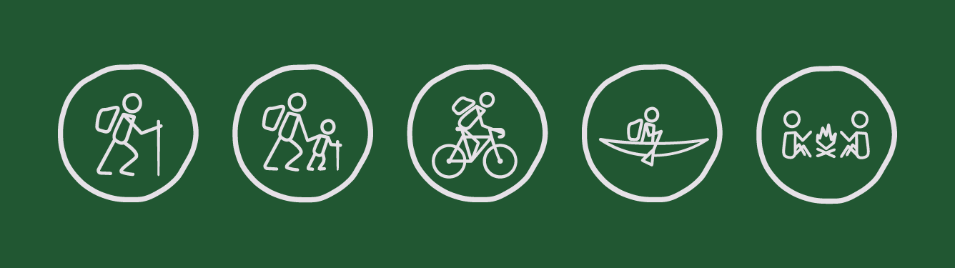
Krosslanders offers various types of hiking opportunities, including hiking, cycling and kayaking. In order for the consumers to be able to distinguish between the different types of tours, we have created a unique pictogram system for the brand, visually coding the characteristics of the given tour.
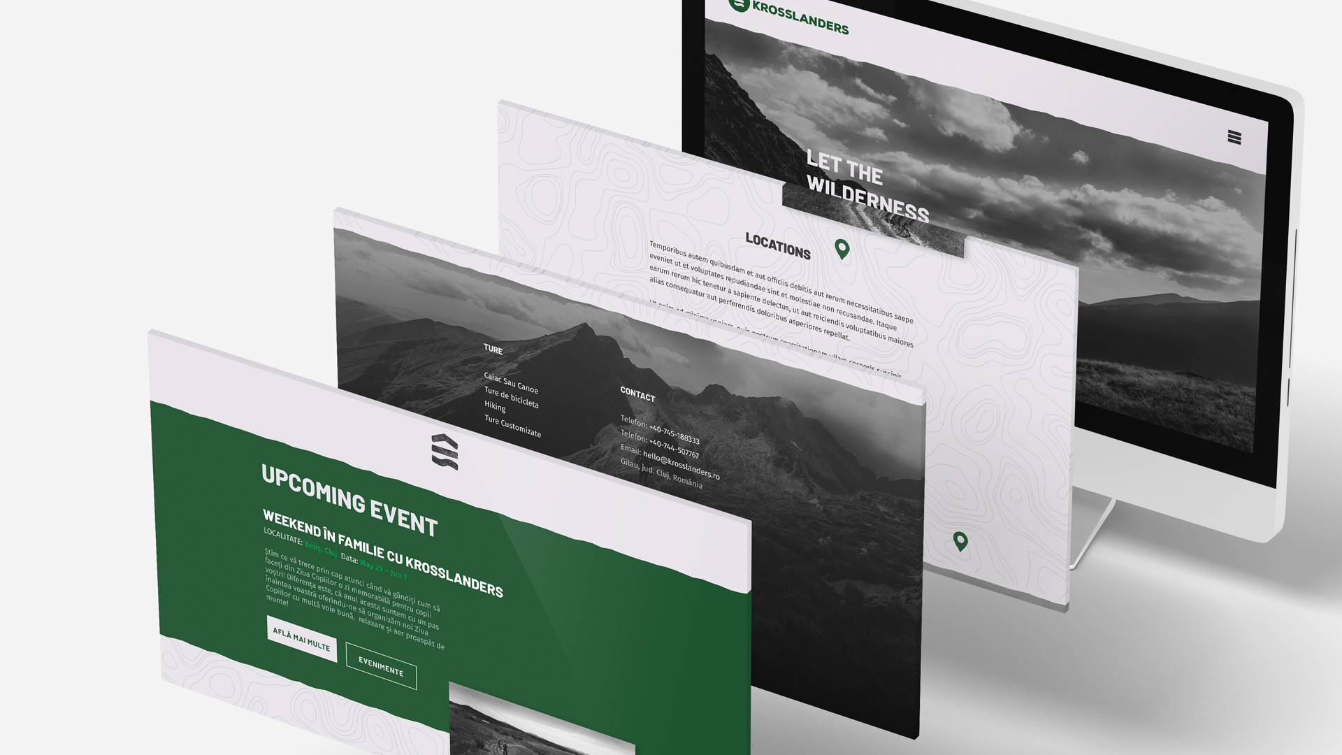
WEBPAGE Last but not least the design of the website. In addition to the philosophy of Krosslanders, the website has an important role in displaying the locations of the types of tours already mentioned- with photos and data. Future events were also highlighted, as the team has no secret intention of having more and more common experiences to create a real Krosslanders community.