It’s a real challenge to build a brand for an illustrator, because he/she builds his/her own visual world through well defined creative decisions. These decisions should not be ignored, because the project itself is about self-identity, self-expression. Welcome to the world of miszlik.
Mission The most important aspect of a project like this is self-identity. The fact that we were working with a visual artist made obvious that we could not use some of the digital solutions that we used with other clients. The biggest task was to display the proximity of the hand drawn illustrations, through the visual identity, style of communication etc.
Outcome What are the characteristics of Miszlik? What are the pillars on which we can build such a brand? What do you think the client thinks we should focus on, and what does the illustrator think we should focus on? This project was about constantly asking questions in order to restore the style of the illustrator in our work.
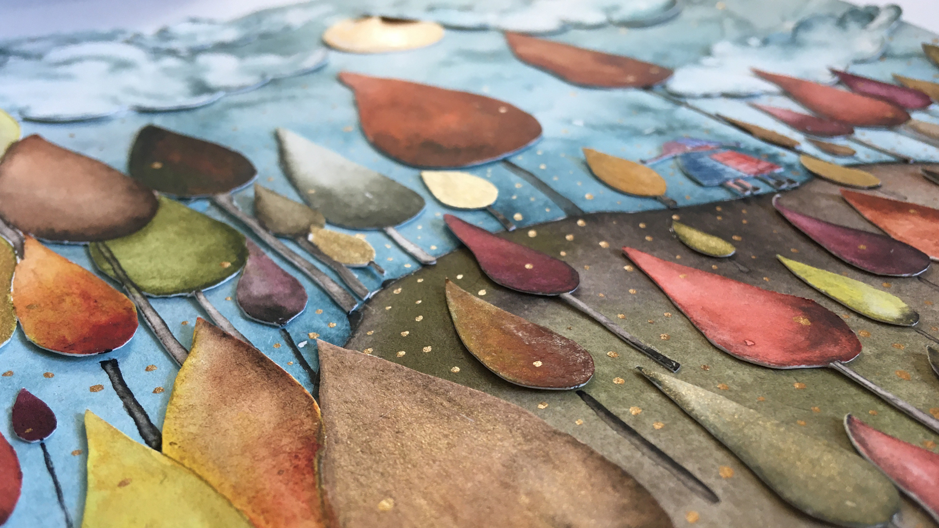
Result Hand drawings with collage technique. It was a challenge to reproduce this in digital. In this case digitalization cannot return the rich details that the paper has. By the end we managed to find a middle ground that retains all the values we discovered during the work, yet still helps Miszlik to compete with its competitors.
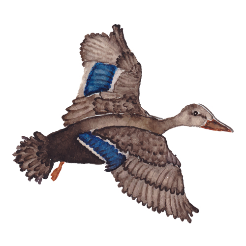
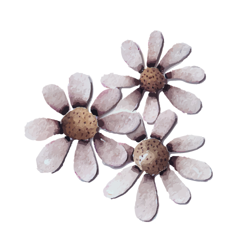
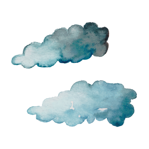
THE PROJECT Creative people can find a million ways to express themselves. In the field of illustrators visual communication is one of the most if not the most important means of expression. It’s a great challenge if someone decides to use only a certain style. You could use paper based solutions mixed with digital, or just digital solutions. But then how would it set itself apart from its competitors? Miszlik as its name suggests works with paper based illustrations, more precisely: hand drawings with collage technique. This was the thing that picked our interest.
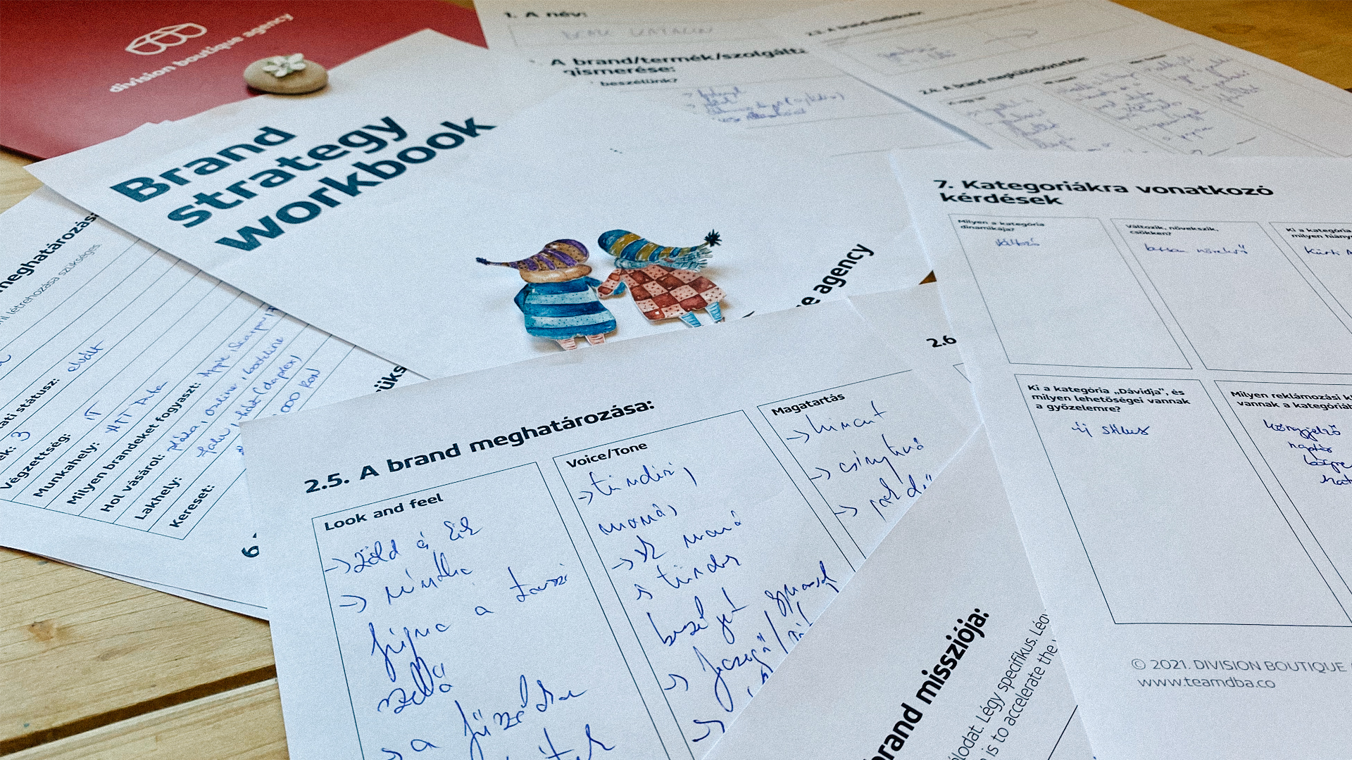
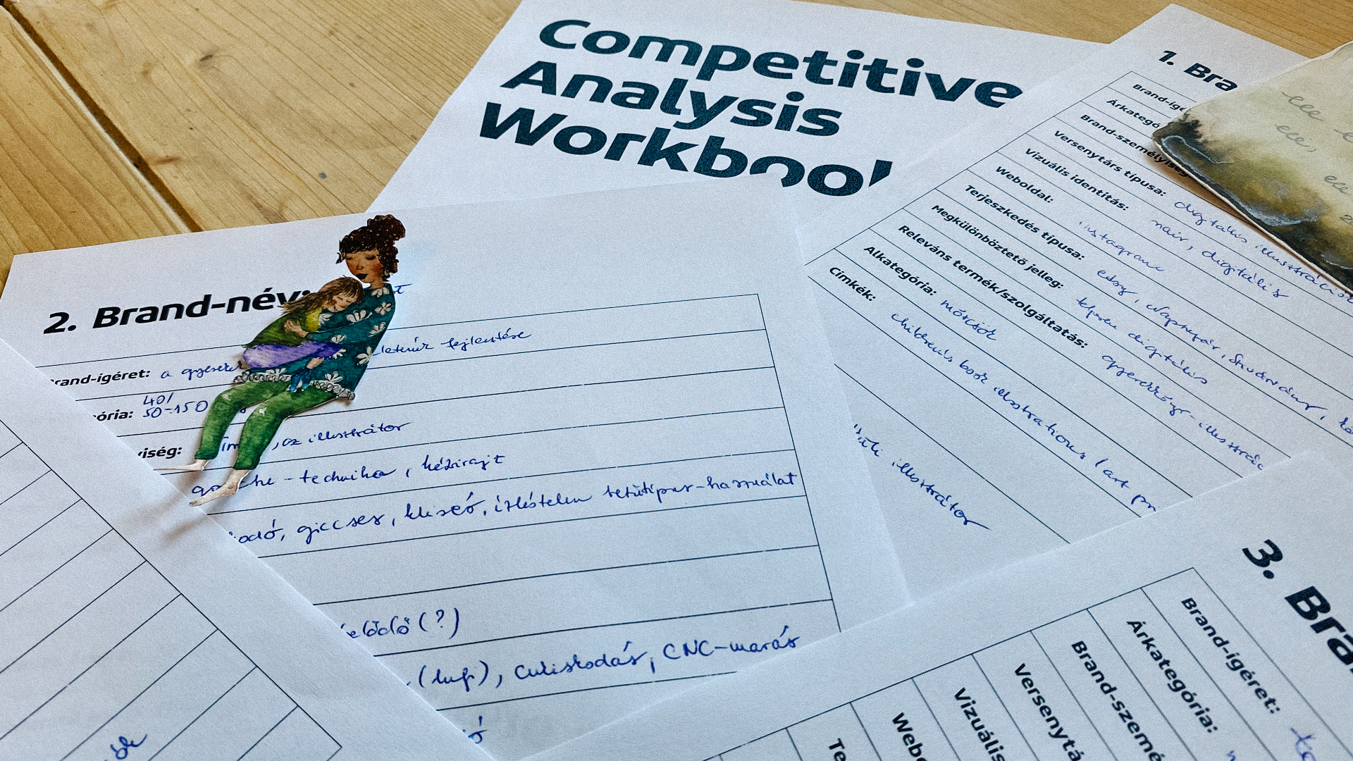
BRAND STRATEGY We would think that the job of an illustrator is very simple. Inquiries arrive, he/she illustrates and it’s done. We could also say that the illustrators are just drawing all day long. During the brand strategy workshop, we wanted to understand the driving forces in the background. Where does the idea come from? Where do the decisions come from? Who is the job for? What is the relationship between the illustrator and the final product? It is impossible to build such a brand without examining the creative processes. Every brushstroke, contour, lint has a meaning, so every decision we make has consequences. Style determines. Strong brands usually have crystal clear cornerstones, pillars, categories, target group, name, etc. You have to go deep.
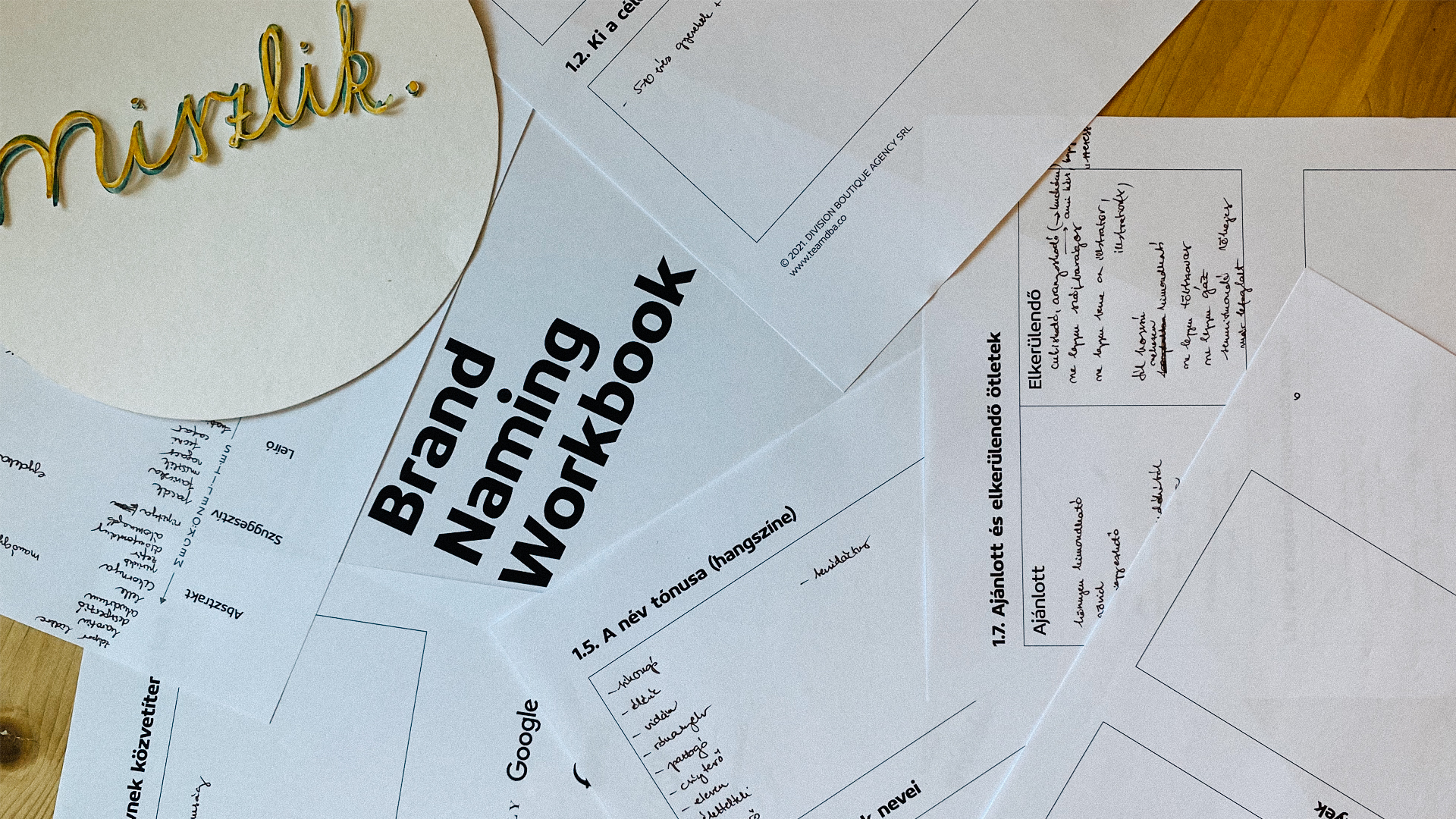
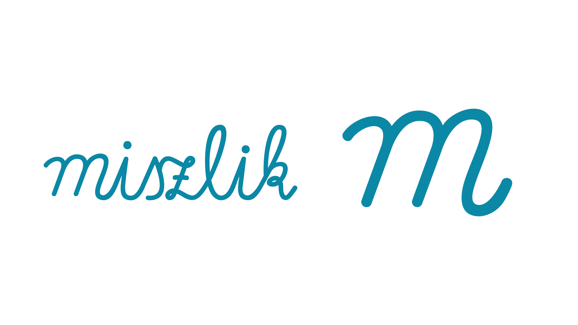
NAMING The style defines the name as well, as with our previous clients, we had dozens of name ideas here as well. It’s an interesting feeling when the final name comes out from the beginning, but you cannot choose it yet, since the safe path is to go through the methodology, in order to check the different name variables. BUT! it’s an uplifting feeling when the intuitions and the final results are the same. Miszlik. Hand draws with collage technique. It has everything in it.
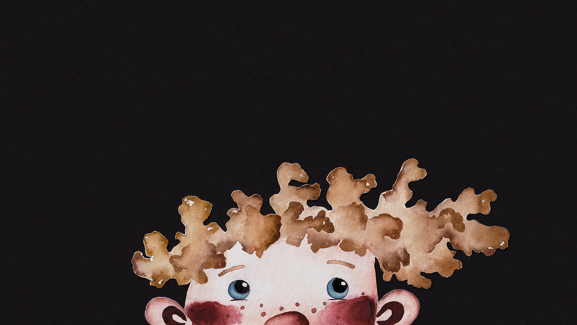
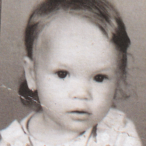
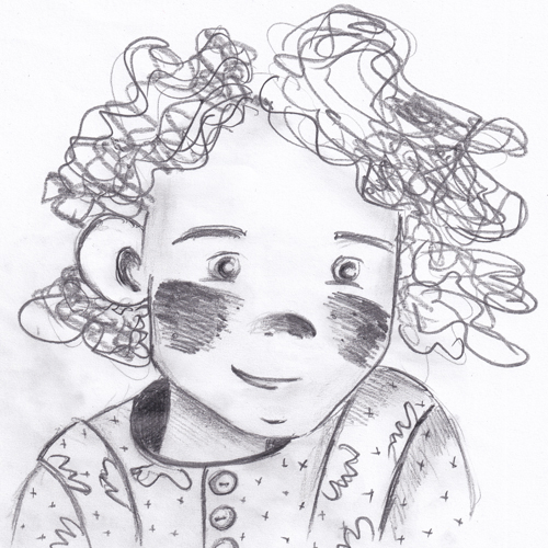
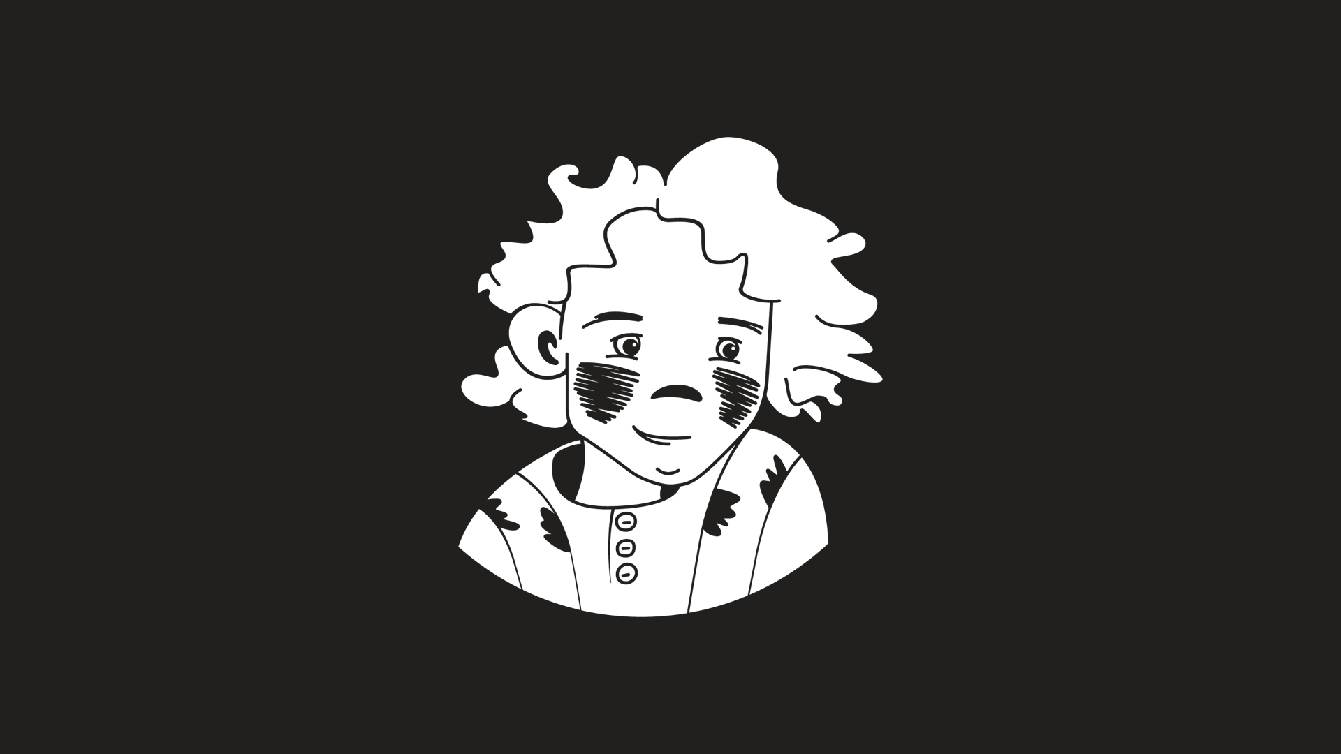
LOGOMARK We thought a lot when designing the logo. We looked through and analyzed a lot of peers from the category. We researched who thinks of themselves as illustrators, and what are the core signs that represent them. In our case the sign is the artist herself. She is the one who shapes the world. She is the one who sets the directions. Since the project is for children and child-souled adults, we decided to start to work from her childhood photo.

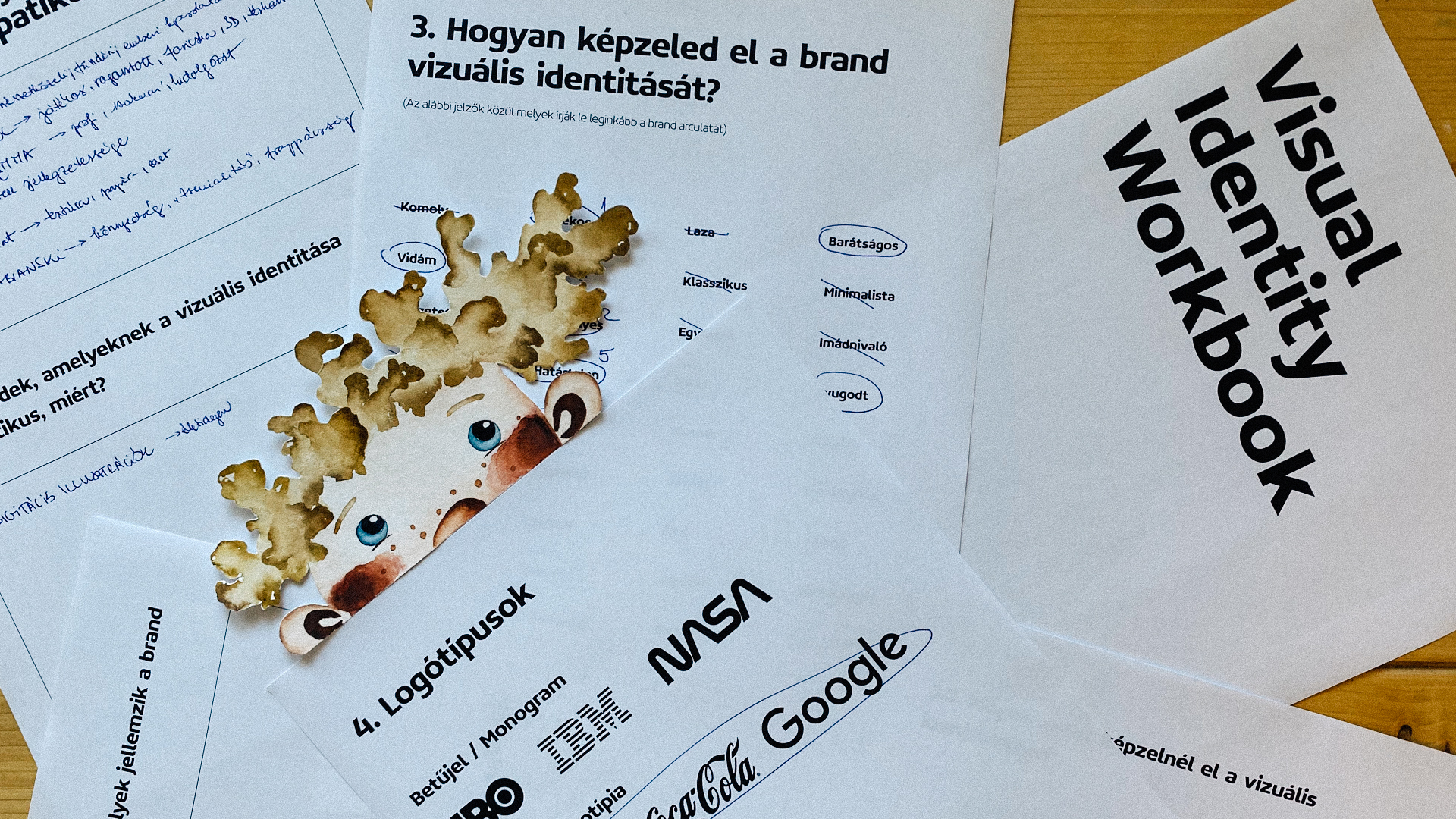
VISUAL IDENTITY The chosen graphic style determines the whole visual language. Hand drawings with collage technique. Let’s divide this in two parts: The paper based hand drawings are very strong and rich in detail. We cannot lose any of these details. We must reproduce this in digital spaces without any loss.
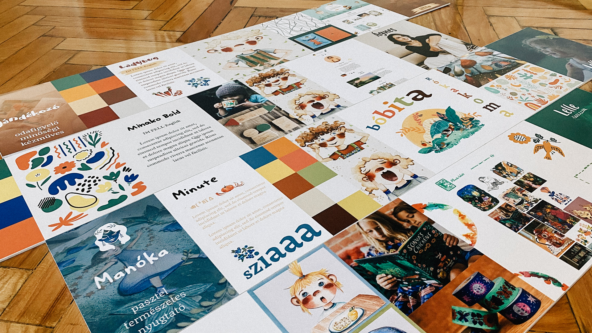
The collage technique determines how the illustrations are displayed. As the different layers overlap, new surfaces are born that give a whole unique look for the brand. Shadows and shapes emerge.
The logotype: The font used as the logo is a digitized version of the client’s handwriting from her childhood that not only lends a playfulness to the brand, but also makes it deeply personal.
One of the biggest challenges of the project was creating the logo version for dark surfaces. In order to create a usable logo for dark surfaces, the color change wasn’t enough, a complete inversion had to be performed in which we filled the unfilled parts of the original logo.
While we digitized the illustrations, the most critical factor was to reproduce the quality of the hand drawings as much as possible. These digitized illustrations can be used for platform expansion.
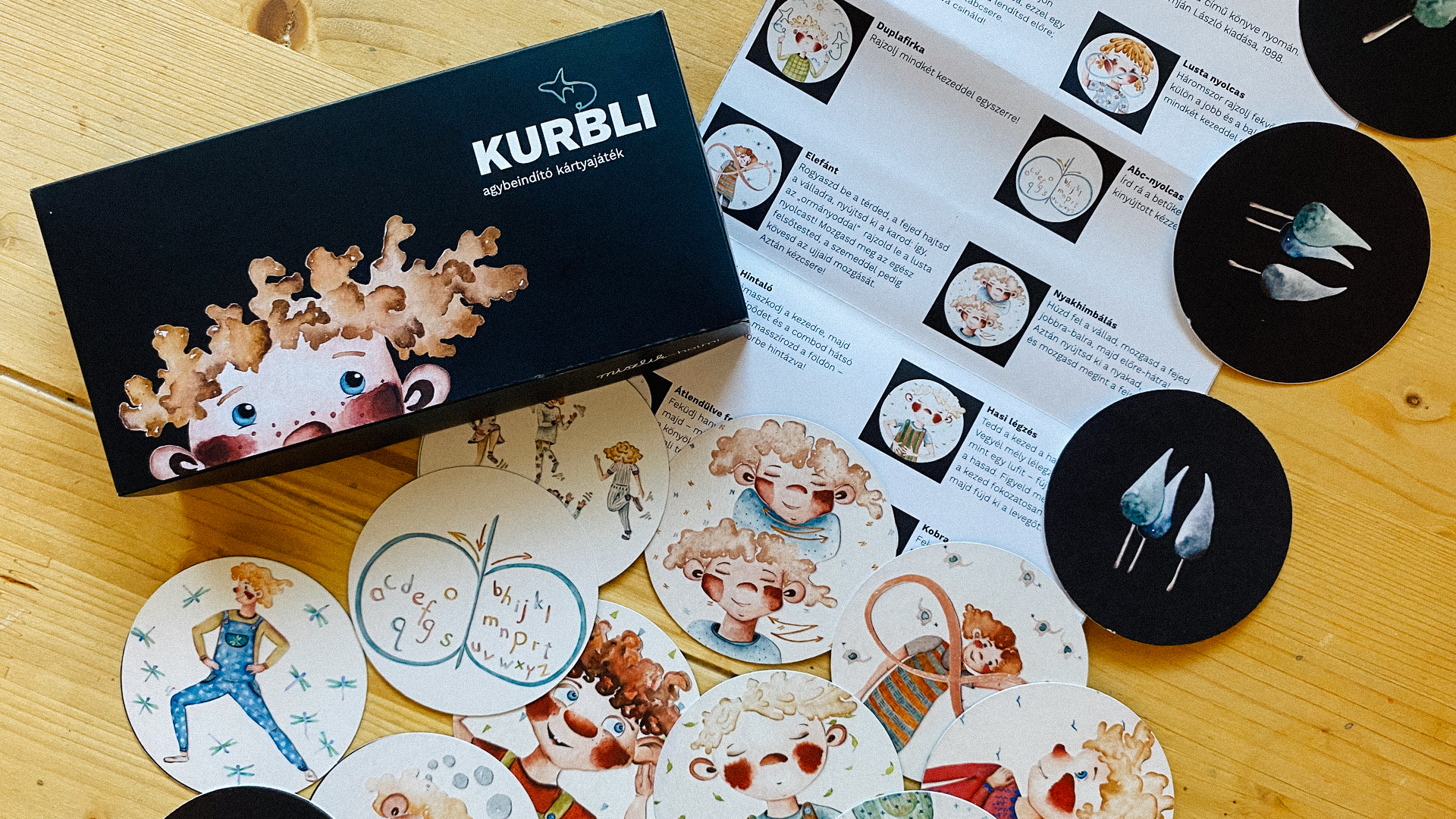
BOARD GAME To conclude our joint work with the client, we developed a board game. Kurbli is a card game created in the spirit of the edu-kinesthetics, which consist of learning while moving and playing. The twenty-six exercise cards in the deck were designed to synchronize the right and left hemispheres of the brain, so it facilitates learning with both sides of the brain. In doing so Kurbli primarily develops our reading, writing and learning skills, while encouraging creative thinking.
Kurbli can be played anywhere, even at school. If a Teacher wants to creatively educate children with learning difficulties they should try playing Kurbli with them. At the same time, in order to develop different skills as effectively as possible, we recommend Paul E. Dennison and Gail E. Dennison’s book Brain Gym: Simple Activities for Whole Brain Learning as a tool.
Have fun!